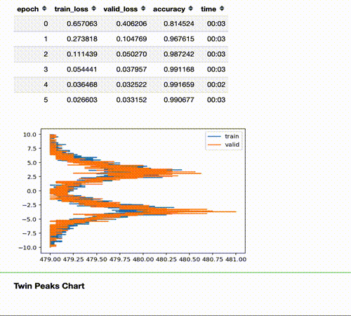
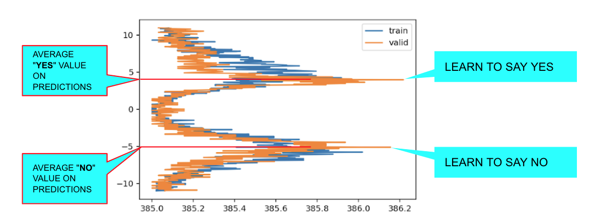
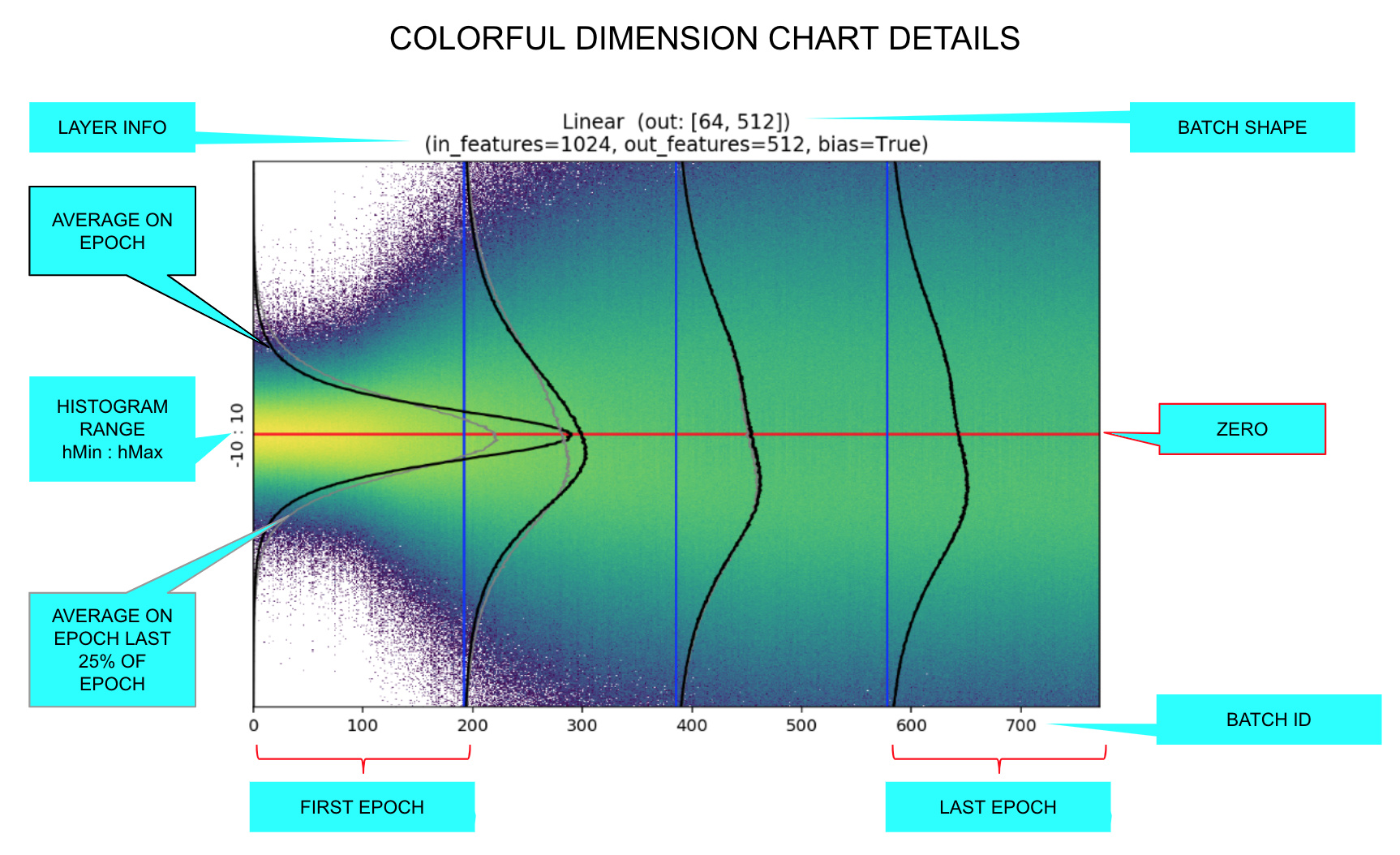
The Twin Peaks chart is a tool we can use to evaluate the health of our model in real time.
It compares, for the last layer, the average of the activations histogram of the last quarter of batches with the activations histogram of the validation set for the same epoch.
TL;DR
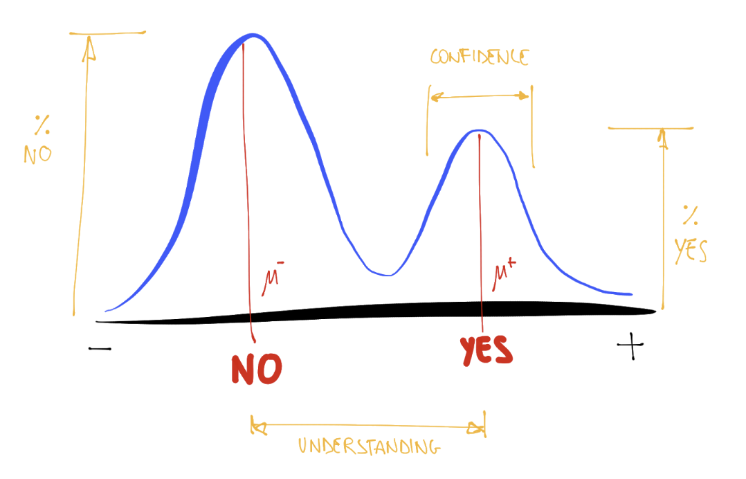
Seeing the Twin Peaks on activations histogram of the last layer is a good sign for a classifier. More separated peaks suggest better model “understanding” (accuracy and generalization).
For a classifier, the positive peak means YES, the negative peak means NO. The heights of the peaks are proportional to the average number of samples.
The twin peaks chart act as a kind of “fingerprint” of your distribution that gives you an intuition about what is happening to the activations of your train/validation/test set.
The Story of The Twin Peaks Chart.
I was working on extending and improving the colorful dimension charts, refactoring the code and adding parameters to control all the details of the charts:
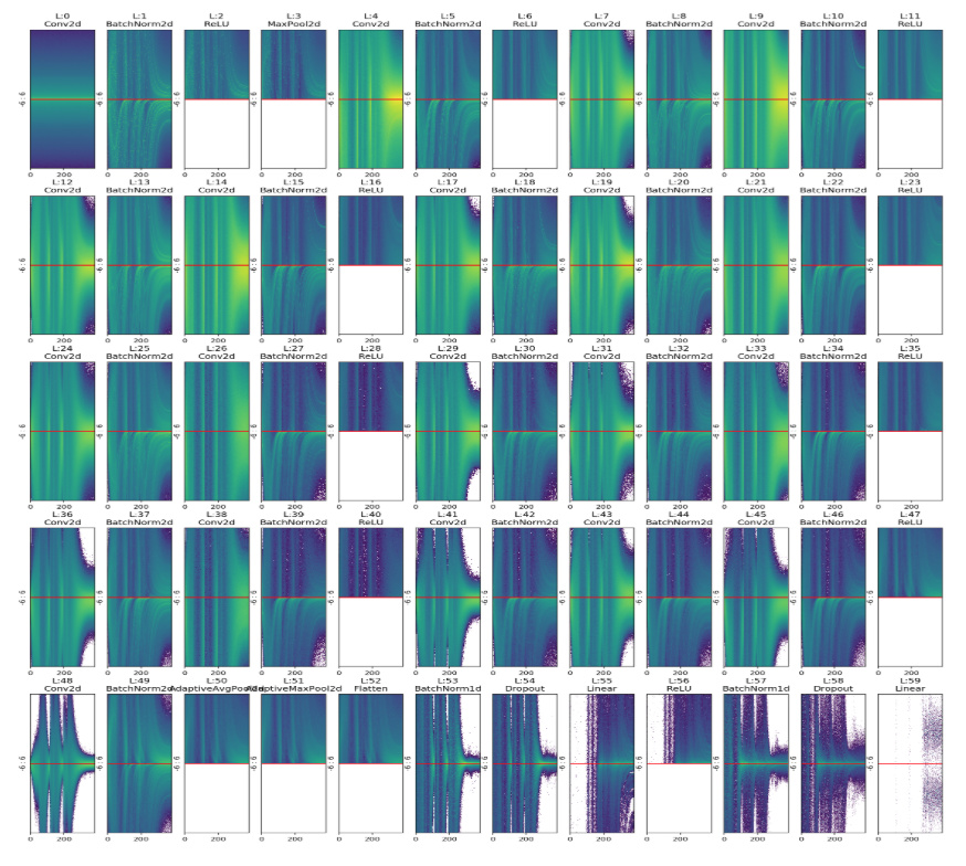
Eventually I added the option to paint all layers at once:
When I started to work with more epochs and higher resolution charts, I noticed a strange pattern in the last chart:
At the beginning I thought it was a bug in the code or a coincidence due to randomness in training. I repeated the training of the network many times with different parameters. Always, as soon as I trained enough, the bifurcate chart appeared in the end.
At the time, to speedup my tests, I worked with a binary classifier with MNIST _SAMPLE: a reduced version with only two digits “3” and “7”. For that reason, the first (wrong) idea I had was that the chart bifurcated because there were two classes. So I trained the same network with CIFAR10 expecting 10 bifurcations. Instead, I got this chart:
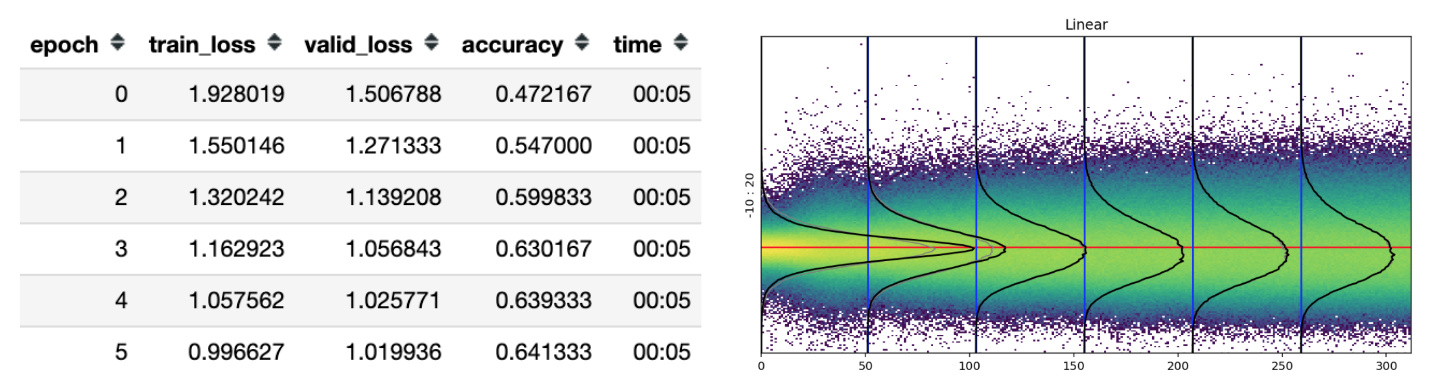
Almost no peak at all! So I started to think that the unusual bifurcation on the chart was a coincidence or a special property of binary classifiers. I decided to go on with training, unfreezing the whole network and… Here comes the magic!
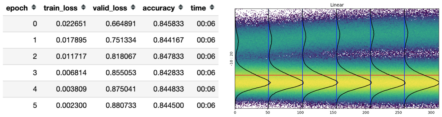
The accuracy (as usual) started to raise again and slowly a small rivulet begun to separate from the main normal trunk.
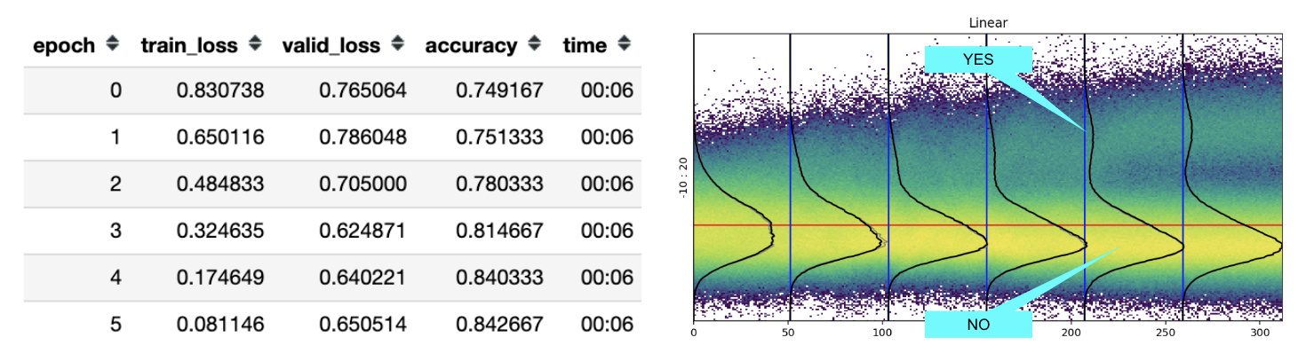
The more I trained, the more the rivulet separates from the trunk and the higher the model’s accuracy.
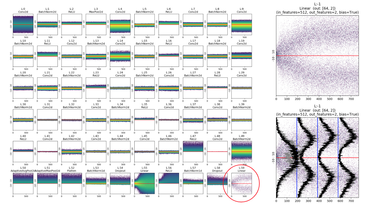
It took me a whole weekend to realize that the small peak near the big mountain wasn’t a particular CIFAR CLASS like “frog”, but actually represented the concept of YES / TRUE and the big peak on the bottom was the concept of NO / FALSE.
To understand why this happens we have to remember that:
-
The result of the last layer enters in the loss function and eventually an
argmaxwill decide which is the winner class (this does not happen in a regression problem as we’ll see, but we still see a similar behaviour). Typically the labels (Y) for a single label classifier are a batch of one-hot-encoded vector of shape [BS, NUM_CLASSES], where on each row we have all zeros but one (the true label). Eventually that is the result we want to predict, so it’s not a case that the height of YES and NO peaks are proportional to the number of one and zero on the labels. In other words: the height of the peaks depends on the number of samples. -
Moreover, as we can see on the previous example, the more separated the YES and NO peaks, the higher the accuracy, probably due to the fact that the YES and NO distribution overlap less and less.
In a multi-class problem it could be interesting to evaluate the distribution and the relative YES/NO concept for each class. For this purpose I’ve introduced the useClasses option that computes the activation histogram independently for each class:
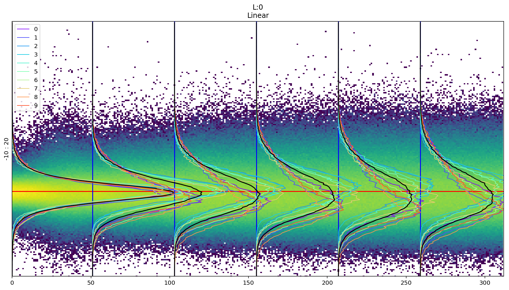
Where: 0 airplane - 1 automobile - 2 bird - 3 cat - 4 deer - 5 dog - 6 frog - 7 horse - 8 ship - 9 truck
It’s interesting to notice that the concept of NO is different for “cat” and “truck”.
LiveChart: Compare Train and Validation Peaks in Real Time
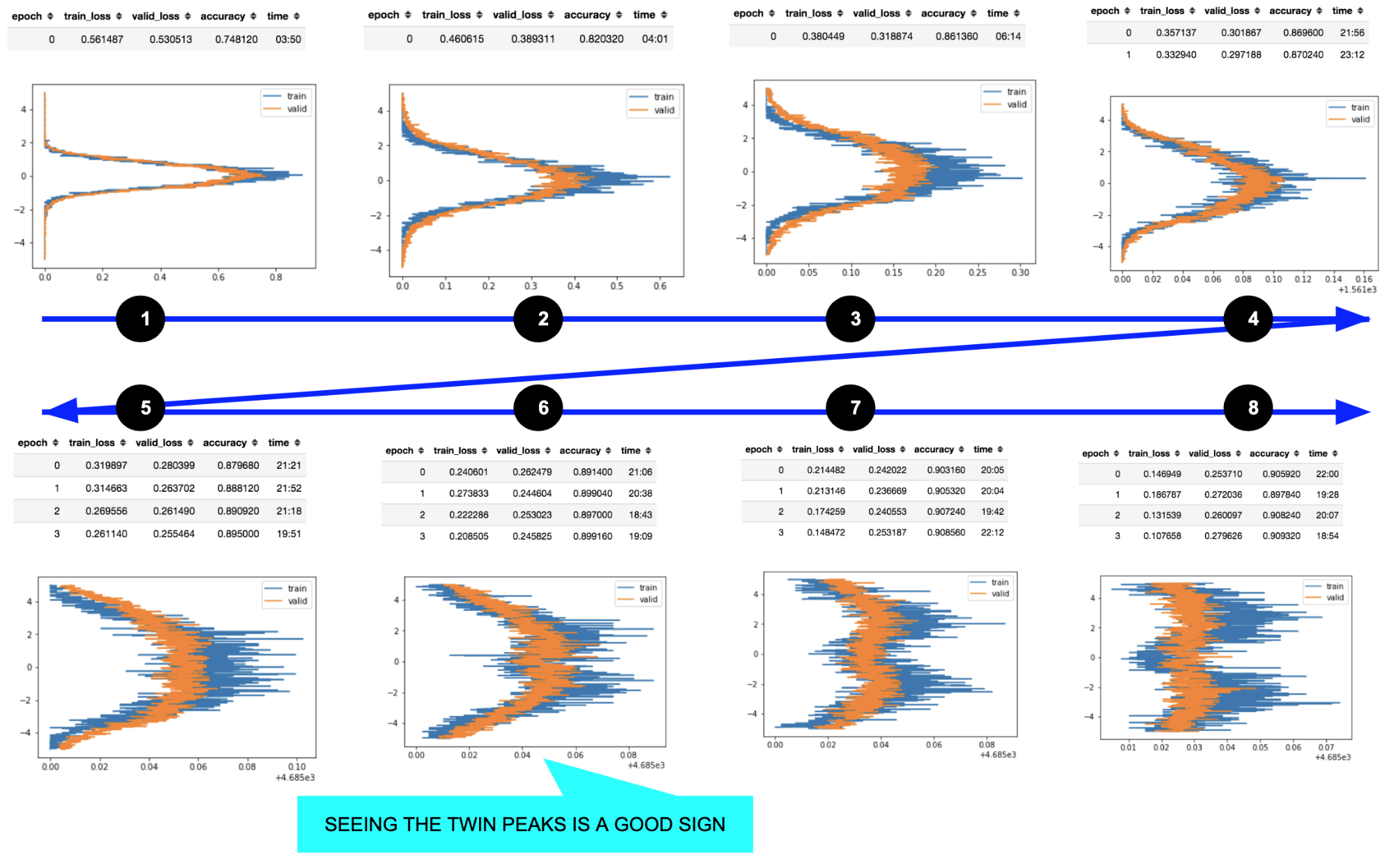
Live Charts from IMDB text classifier example
One of the most important insights from these charts is how the activations change during training. Instead of waiting till the end of a long training, I’ve added a callback that plots the activations histogram of the last layer for both train and validation set on each epoch.
Comparing them in real time gives you an intuition about what happens in the model.
For example, in the picture above on cycle “8” we’re probably going to overfit because the shape of the peaks and their separation are different for training and validation set (your model is adapting too much to your training distribution, despite the validation set, and training/valid was randomly split); on cycle “1” train and validation curves are almost identical and the two losses are the same: so, despite the poor performance, the model is generalizing very well.
For the same reason if you compute this chart for the test set you can have an intuition about how the test distribution compares to the train one.
Generalization to other models
I performed a broad study, trying to understand what happens in the last layer for different models and datasets, from image classification to sentiment analysis and regression:
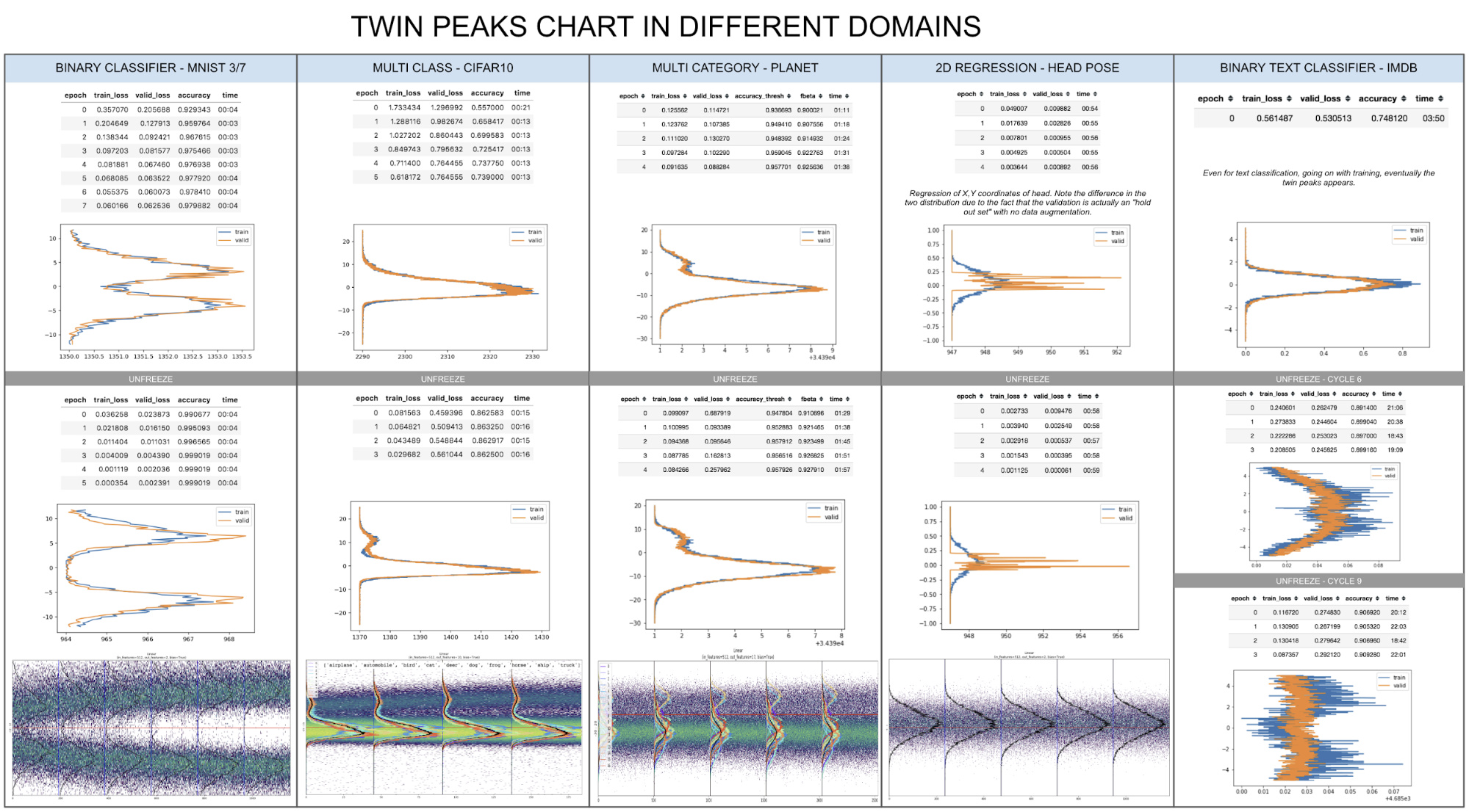
And the result is surprisingly stable, especially for classifiers: if you train enough and plot the activations histogram of the last layer, you can see the twin peaks.
Only on the regression problem (column 4) you see something different:

Even if in a regression problem (head pose estimation) we don’t have the concept of YES/NO we can still say a lot of things looking at these pictures:
- The two curves are different because the validation set is holdout set (Person 13) never seen by the model.
- We can see that the train curve is normally distributed, probably due to two reasons: the first is that in the training set there are a lot of different “heads” in a broader range of positions around the center of image; the second is that we’re performing data augmentation on the training set and, according to the curve I see, maybe we need to add some more translation to the augmented signal because it seems that the model never saw a head in the corners of the image.
- The validation values are correctly concentrated on a small region both for x and y coordinates, result compatible with limited movements of Person 13. Note that in regression problems like these, the last layer contains the actual predictions that are sent to the loss function (usually Mean Square Error).
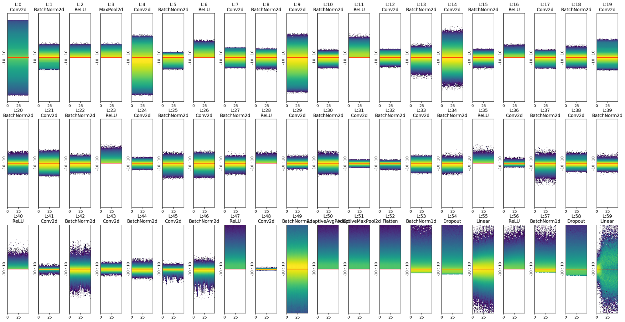
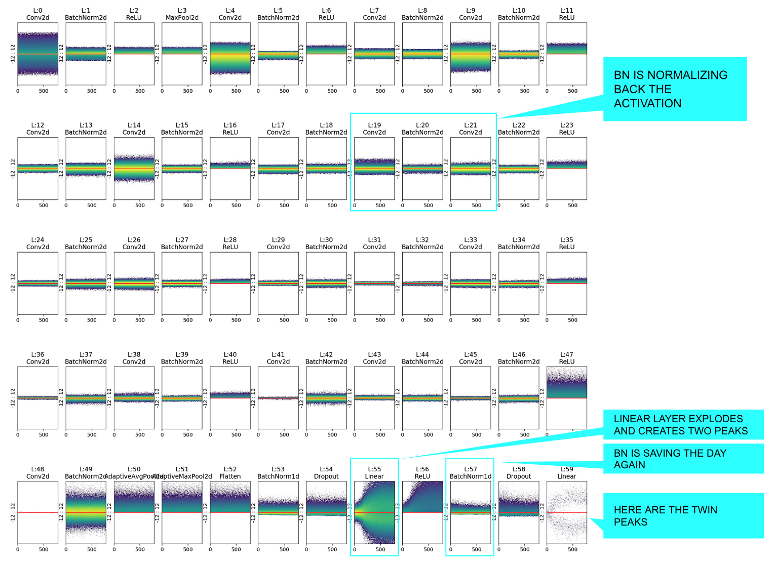
The Colorful Dimension Chart in two lines of code
The activations histogram images are both colorful and useful to understand what’s happening inside your network.
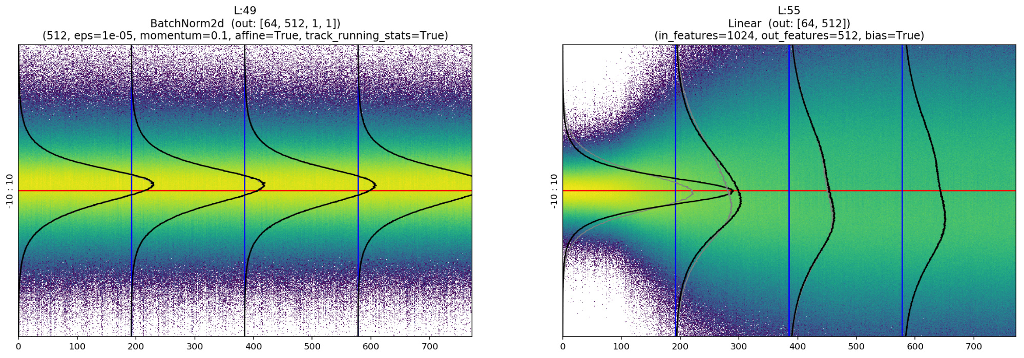
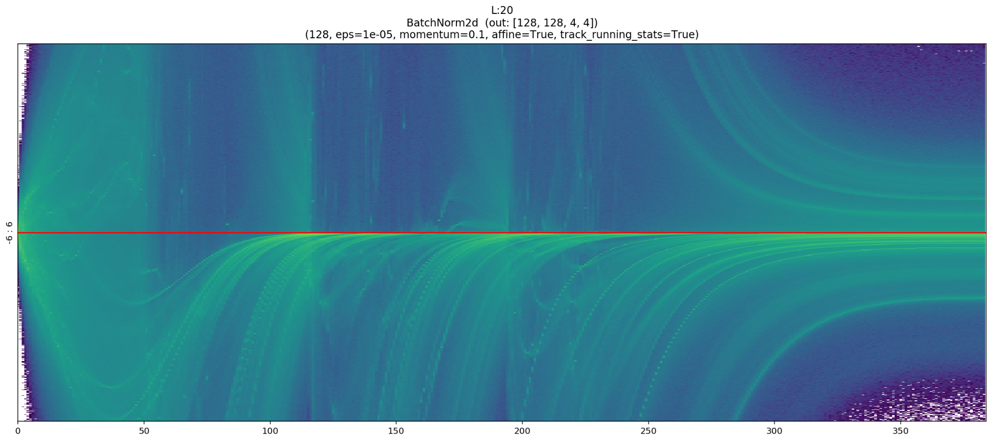
The following example is a representation of all the layers (Conv, Linear, Relu; BatchNorm etc…) for a resnet18 binary classifier on MNIST_SIMPLE.
In this chart we can notice, for example, the normalizing effect of BatchNorm that takes the unbalanced output of layer 19 and shifts its mean to zero, or re-balances the activations again after the “explosion” of layer 55.
Plotting these histograms is now very simple: just add two more lines of code, one to set the ActivationsHistogram callback function and the other to actually plot the charts.
data = ImageDataBunch.from_folder(untar_data(URLs.MNIST_SAMPLE),bs=1024)
# (1) Create custom ActivationsHistogram according to your needings
actsh = partial(ActivationsHistogram,modulesId=None,hMin=-10,hMax=10,nBins=200)
# Add it to the callback_fns
learn = cnn_learner(data, models.resnet18, callback_fns=actsh, metrics=[accuracy])
# Fit: and see the Twin Peaks chart in action
learn.fit_one_cycle(4)
# (2) Customize and Plot the colorful chart!
learn.activations_histogram.plotActsHist(cols=20,figsize=(30,15),showEpochs=False)
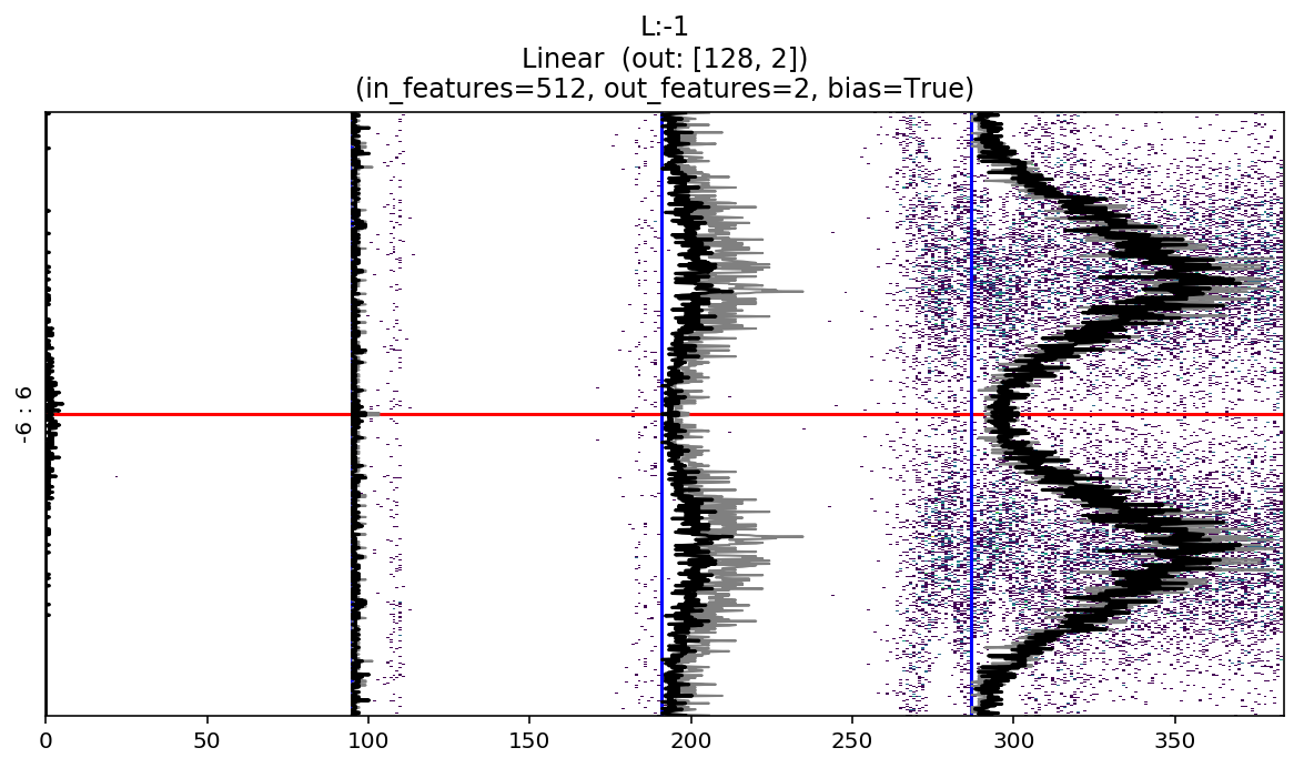
If you want to focus on a single chart and activate all the telemetry you only have to write:
learn.activations_histogram.plotActsHist(t$figsize=(20,6), showEpochs=True, toDisplay=-1, hScale=1, showLayerInfo=True)
Learning rate too high
For example, pretend that we made a mistake and set a learning rate of 1e+2 instead of 1e-2; this is what you’ll see:
Even if eventually it seems to converge, the activations mean and standard deviation continue to jump around and be unstable.
NOTE: The colorful dimension charts are made by plotting the activations histogram epoch by epoch, coloring the pixel according to log of intensity.
Code and docs
All the code for both the Colorful Dimension and the Twin Peaks charts is wrapped inside the ActivationsHistogram class that extends the base Hook class to leverage all the existing fast.ai infinitely customizable train loop ®.
You can find the all the code on: https://github.com/artste/colorfuldim
Where:
- sample_usage.ipynb : Documentation and samples for all methods.
- TwinPeaksChartPost.ipynb : Contains all the charts and experiment of this very post.
- sample_mnist_binary_classifier.ipynb : Complete sample on mnist.
- sample_cifar_multi_class.ipynb : Complete multi class example.
- sample_head_pose_regression.ipynb : Complete regression example.
- sample_planet_multi_category.ipynb : Complete multi category example.
NOTE: the notebooks ad pretty big because of the high number of hi resolution charts…
Feel free to pull request adding sample notebooks that shows colorful and twin peaks charts in action! …Maybe we’ll see something even stranger and more interesting 
NOTE: the fast ai v2 version of ActivationsHistogram is coming soon!..
Credits
Great thanks to @zachcaceres and @simonjhb for the support and patience!