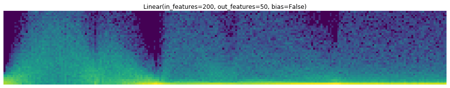
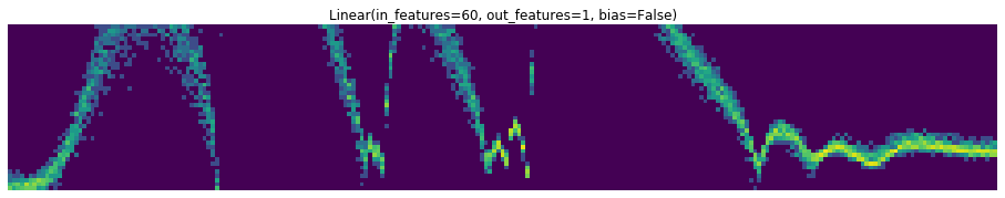
I am looking for a graph Jeremy shown in a lecture (and I think I saw it on his twitter recently but could not find it) where he shows either the activations or the weights starting to increase and then collapsing, increasing and collapsing. The graph had kind of a blue background with very fine green lines… Not too sure if it is related to ActivationStats.
stats = ActivationStats(with_hist=True)
learner = Learner(dls, model, cbs=[stats])

#... fit here...

layers = [m for m in flatten_model(model) if has_params(m)]

for i, layer in enumerate(layers):
    fig, ax = plt.subplots(figsize=(16, 32))
    ax.set_title(layer)
    stats.color_dim(i, ax=ax)
This will print the colorful graph for each of your layer.
Seems really helpful for me to find problematic layers: