Share your work here ✅

That’s correct. :slight_smile: There are technical books that have the same design and color of cover page as of self help and novels.

Fixed the code link for the post!

Got through exercise 0-3, that was great fun! Took the advice to also get hands dirty as fast as possible. Did this little web app that tries to classify your facebook avatar into one of 36 Oxford pets (Had to drop Sphynx since it was getting to much matches :smiley: )

Demo: https://the-dog-in-me.andersjurisoo.com
Code: github.com/ajthinking/the-dog-in-me

3 Likes

Wow, inspiring story :slight_smile: Thanks for sharing!

1 Like

I made an app to classify skin cancer images and deployed it using Render. I wrote about how easy it was to make and deploy in this Medium article:

6 Likes

Hey there,

I want to share my MNIST equivalent with you :smiley:
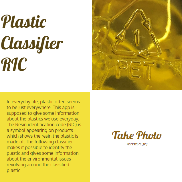
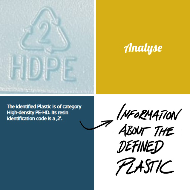
This is my little image classification app that distinguished between the seven different plastics defined by the industry standard RIC (resin identification code). I built up my own dataset by taking photos almost during every shopping tour. By now my dataset contains of ~450 pictures of the seven different plastics.

This is my dataset on kaggle: https://www.kaggle.com/piaoya/plastic-recycling-codes
You are very welcome to contibute :partying_face: (no websearch pictures, please)

My goal was to built up a little website or app where you get information on whether the plastics are ready to recycle or not. What are alternatives? Which specific effects has the classified plastic on our health? What does it mean for the environment? Here are some pictures of my mock-up - you can test it also on render:
https://plastics.onrender.com/
(As long as I still have credit on render :wink: )

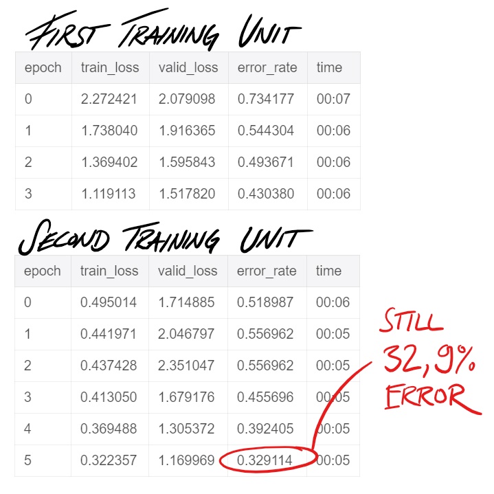
Sadly the training of the model is not so good yet, I think this might be because of the lack in data.

Do you think this could be interesting to develop further? Is anyone interested in collaborating to make this open available as a service?

5 Likes

Very cool! I tried something similar, but I didn’t get nearly as high accuracy.
Do you have any thoughts about why the plot of image activations for the wrongly classified are in such weird places (e.g. the whitespace of the Javascript)?

This is great - thank you for sharing. I searched for an article like yours a while ago :wink:

1 Like

Me too, I generated my own version of MNIST :laughing: throwing in whatever fonts I found in my system (https://gist.github.com/marypwchin/7f4c7e57aebce5b68270cdb88d39bfed). Not just numbers but A, B, C, … and a, b, c, too. I use the same dataset from 3 learning sessions:

  1. Classifying alphanumerics 1, 2, 3, ..., 9 and A, B, C, ..., Z and a, b, c, ..., z.
  2. Classifying font type.
  3. Classifying font style.

Alphanumerics aside, I also tried face recognition and donkey-mule-horse recognition. Blessed be all donkeys, mules and horses (and all alphanumerics).

1 Like

Thanks for pointing out this. I rescaled the images to 352 and did the training again as done in the notebook “Lesson 6: pets revisited” to view the activations more clearly. After doing that also, the activations are still in places where we cannot find the relation of the activations to the predictions.

Am I missing anything? Can anyone in the forum help us with this?

github repo

1 Like

Hi All, First I thank Jeremy for this awesome course, I did some fun project based on lesson 1, its a vehicle classifier, I took images from Google and feed it to the fastai library to classify different type of vehicle (SUV, Formula1, Hypercar, pickup truck, batmobile, container truck, heavy duty truck, convertible) without change any default setting achieved 90%~ accuracy with resnet50. my next step will be adding more images to each class and add more transfort medium like a bike, bicycle, auto,bus etc., then integrate with live traffic cam to do analysis about the transport medium movement. again thank you so much for this awesome course.Screenshot_2 with resnet 50

looking for suggestion to add more things in this fun project. Thanks

Hi all,

Just finished Lesson 1. Here’s my writeup on a fun little bear classifier I built using ImageNet data: https://blog.derekmeer.com/what-kind-of-bear-is-best-building-a-bear-classifier-with-fast-ai

Big takeaway: image URLs from ImageNet aren’t always good. For the black/brown bear images, I found that I could use only about 400 images, or 15% of the data.

Despite this, I’m surprised by how good the results are. I probably need to test on something outside of the ImageNet dataset to be sure, but 2.5% error rate is pretty good!

I also found an ImageNet mis-classification. I have no clue how common that is, or how to report it. How do you normally deal with something like that? Thanks again for the great (free) course!

1 Like

Color Swatch Dataset

I am excited to refresh my knowledge of deep-learning with this years release of Part 1 and Part 2 (soon to be released).

While we all wait for Part 2 to be released, I went back and rewatched Part 2 from 2018.

In Lesson 11 there is a new idea that was introduced with DeVISE that can find things in the dataset that it may not have learned natively. The quote that kicked off this line of thought was “…I don’t know much about birds but everything else here is BROWN with WHITE spots, but that’s not…”

The comment about the color brown now has me thinking about object detection and can we ask if the model knows something about color, for example, “Red Car.”

Anyways here’s a link to the notebook and one to the dataset.
https://github.com/dusten/Project_Ideas/blob/master/generate_color_squares.ipynb

1 Like

Hi everyone! Just wanted to share a quick and fun project I put together. Essentially I took everything I have learned from FastAI, found a very interesting White-paper on Arvix.org (link below) and gave it a shot to replicate their work!

Predicting price action movement for currency pairs with ~82% Accuracy

Research Paper:

Amazing work by: Yun-Cheng Tsai, Jun-Hao Chen, Jun-Jie Wang

Github repository:

I have set up the repository with different Jupyter Notebooks for:

  • Downloading data using Oanda API (Key has been destroyed)
  • Data pre-processing & Applying indicators
  • Converting Charts (sliding window approach)
  • Using FastAI, DenseNet Architecture

I just finished Part 1 of the new FastAI course so thank you so much @jeremy, @rachel, and to the team for such an AMAZING course. I cannot wait for Part 2 coming in the summer.

Hope this helps others!

PS. I’m learning more about Finance/Quant trading & am very new to Machine Learning so please don’t mind any mistakes in the notebooks. Still learning :slight_smile:

6 Likes

I’ve created a python package inltk: Natural Language Toolkit for Indian Languages, available for download on pip.

It contains Language Models, Language Classifier and Tokenizers for 10 Indic Languages, namely Sanskrit, Hindi, Punjabi, Gujarati, Nepali, Kannada, Malyalam, Marathi, Bengali, Odia which I had trained using fastai.

Here’s a Demo.

I believe this toolkit will be helpful in developing apps which will reach and impact millions in their local language as we bring next billion users online.

Big Thanks to @jeremy and fastai team, for everything you do!

10 Likes

Hi everyone!

I’m working on lesson 2 and decided to make a movie poster classifier, was not expecting much since the data from google was really noisy and movies usually have more than one category but I decided to give it a try.

output of learn.fit_one_cycle(8):
|epoch|train_loss|valid_loss|error_rate|time|
|—|---|—|---|—|
|0|2.648347|2.040480|0.718905|00:11|
|1|2.306737|1.947001|0.685323|00:11|
|2|2.088367|1.916026|0.684080|00:11|
|3|1.922450|1.866856|0.657960|00:11|
|4|1.790923|1.856265|0.669154|00:11|
|5|1.686638|1.840987|0.670398|00:11|
|6|1.597364|1.831289|0.665423|00:11|
|7|1.541694|1.831808|0.670398|00:11|

That seems like a disaster but checking the confusion matrix is a little bit more encouraging

It learned something and the most confused categories make a lot of sense.

What I found weird is that my learning rate plot after unfreezing just goes up
Selection_060

Anyone know what that means?

this is a pet project I am involved in, not sure if this is the right place to post but it’s loosely inspired by me learning fastai, so I thought it might be interesting:

We felt it’s important to keep up to date with recent discussions in machine learning across the net, so I helped writing a site that collects this kind of content: hype.machlearning.net

It can do some interesting queries, e.g. changes to SotA in the last month, sorted by “top”, meaning: first places first:

https://hype.machlearning.net/?so=top&t=1m&SotA=

It also knows which arXiv papers have been written by which group, so you can e.g. see all papers discussed which were written by Google in the last 3months, ordered by date:

https://hype.machlearning.net/?so=new&t=3m&a=Google

It uses a sentiment model to decide which twitter messages are related to machine learning and also tries to find the most significant phrase in a conclusion of an arXiv paper (Could it change the SotA? What are problems with this approach?) and displays it next to the paper’s title

1 Like

I have worked on news categorization of AG News dataset using the Fast.ai library. Got an accuracy of 93%. You can check out the GitHub repo here

2 Likes

Try with Arcface loss.
I have implemented it in following kernel which I have created for identification of whale species using tale. This has hoping 5004 classes. i stand with Score of ~~93 on test set
https://www.kaggle.com/jaideepvalani/arcface-humpback-customhead-fastai-score919/

3 Likes

From your diagram it looks like you cannot gain super-convergence. Just run learn.lr_find() again, and let us know if the results are different. It seems to me that this plot always provides different results if I repeat:

learn.lr_find()
learn.recorder.plot()

You can always use the learn.fit_one_cycle(1, max_lr=slice(3e-5,3e-4)) which should be the safe default.
I am not sure why the plot is always different. Maybe I am missing something.

1 Like