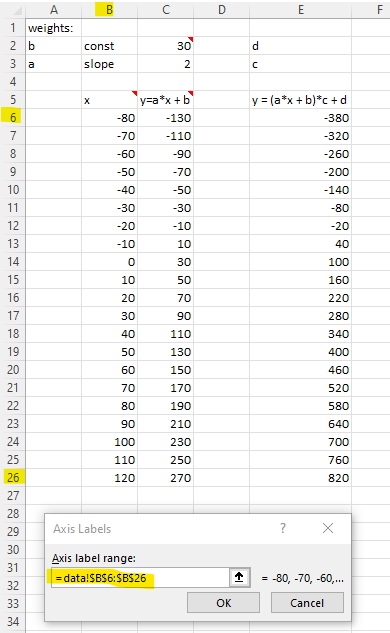
The difference is I set the x value between -80 to 120 with a step of 10. So, I can draw a line chart easily.
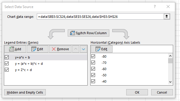
You used random numbers to generate x. Because Excel can treat each row as a data point. So, the chart may not the true reflection of the data. Check your "Horizontal (Category) Axis Labels, the setting should link to the cells for x value (not hard code value generated by Excel). I pushed my file to your repo. So, you can inspect it.

Excel tips: Highlight data and then select a chart type. Delete those columns you don’t want in the chart.

