Help with Algorithm for Covid19 Relative Risk

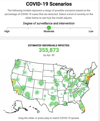
Hey all, I’m working on tracking/mapping the relative risk of Covid19 in the US. 50 cases in Kentucky is not the same as 50 cases in NYC. People aren’t good at normalizing out other variables like population/hospital access so I want to do that for them visually. I have a prototype here with github here. Code for prototype is messy, it’s being properly sorted today and tomorrow.

I would like help from data science people with the algorithm that combines cases, population, hospital data (location, # of beds), regional situation (risk level of nearby counties/states) to create a risk factor that makes the seriousness of the situation comparable between areas.

Things to think about:

  • 20 cases in a city of 1 million is obviously worse than 20 cases in a town of 10,000.
  • At the same time 5 cases/100,000 in NYC is much worse than in a county of 20,000 people (1 case)
  • Is there good research on the role of population density and the spread of disease.
  • How does the risk of neighboring counties/states decay as distance increases?
  • We have a dataset of every hospital and # of beds, how do we best utilize it?
  • How can we utilize data about how hospitals will adjust over time (more ICU beds created, elective procedures ceased…etc)?
12 Likes

Hi Robert,

A few ideas from my end to contribute on how to structure it. Take what you need!

I think a single ‘number’ (a rating from 0 to 100) could be built using a combination of two distinct metrics, capturing the following things:

  1. Transmission Risk – “chance of getting the virus”
  • Geographically-driven Ro, capturing:
  • Population Density per square mile
  • Temperature factor
  • Restrictions factor (rating 0 to 1 on how severe restriction measures are in place)
  • Public transport (rating 0 to 1 on public transport use)
  1. Healthcare Service Capacity – “chance that my healthcare system can take care of me”
  • Hospitals (preferably Available Beds) per square mile
  • Possibly Medical staff per square mile
  • Possibly Medical funding per square mile

For each state, you would need one number for the big cities and another for the rural areas.

Effectively, it breaks down to “What are my chances of getting the virus based on where I live? If I did get it, is there room for me at a hospital”. The simpler it is, the better. Breaking the single ‘number’ into two parts will help people wrap their heads around it without needing to know much more about the details. Each distinct metric is dynamic and will change over time. The question will be how to weigh each distinct metric in coming up with the single ‘number’. You could start with a 50/50 split.

3 Likes

If you express your numbers as probability, you can just take their product (or, more likely, the sum of their logarithms).

By the way, don’t forget the correlation between both metrics : the more likely you are to catch the virus and the less likely you are to find an hospital bed (due to other people being in hospital for the same cause) for a fixed number of hospital bed.

1 Like

If you can have them in data for collaborating or filtering tabular, it could be very useful to us.

1 Like

Working on breaking this down today so the code is much more ordered but we will be sharing all data through a simple API by tomorrow at the latest. I’ll make sure to tag you.

1 Like

Hello! I haven’t dug through your code yet, but wanted to let you know: Clearfield County, PA seems (based on Googling, other sources) to have 0 confirmed cases, but this visualization shows 24 cases. Not sure what accounts for it.

2 Likes

Slightly OT, but I think it would be interesting to see the clusters/R0 in different geographical areas against the “It’sJustTheFlu” sentiment on twitter from those same geographical areas. I’m not sure if this kind of data is available especially for twitter.

2 Likes

Thank you for reporting, I will look into it ASAP. Best data source for county level data is https://coronavirus.1point3acres.com/. All scraped by volunteers because the US govt is not reporting data in any centralized way.

That site has no API yet (coming soon) so we have volunteers copying it over. I’ll hand this off to them, thanks again.

1 Like

This is fixed now, it was a silly mistake on my part. Thanks so much, I could’ve gone a while without noticing that. Tests are coming in a few days.

I think this is an excellent way to think about it. Some of that data will be hard to source but we are also seeing amazing work by volunteers who are collecting data that the government has failed to provide in a useful way.

For transmission, we may be able to track it through growth rate, although it is hard because with incomplete testing in the US we have to tease it out. We will be adding time series data in the next few days which will at least give us a start. Thanks for the ideas, I’ll keep working on it.

1 Like

I think the URL (http://covidcompare.com) may now be down?

Anyone have any feedback on the type of data I am collecting for crowd sourced data?
https://corona-census.firebaseapp.com/

I will try to make this available as a data source for the above calculations / other uses.

Hi everyone,
I’m using this dataset:

and I’m having trouble understanding the data.
It has 3 separate time series data for ‘recovered’ , ‘infected’ and ‘dead’ and an overall summary data.
How do I combine these time series data to predict the fields in the summary data for the next month or so?
Please help me out.

Thanks,

Hi @MadeUpMasters,

This looks so useful and promsing. Thank you and your team for doing this work.

My group of volunteers and I (mostly geospatial data science folks) are working on something very complementary. I just shared some info about it here: Mapping US health system capacity (ICU care in particular) for COVID19 surge preparedness

Re:

  • We have a dataset of every hospital and # of beds, how do we best utilize it?
  • How can we utilize data about how hospitals will adjust over time (more ICU beds created, elective procedures ceased…etc)?

and

@jordan’s

  1. Healthcare Service Capacity – “chance that my healthcare system can take care of me”
  • Hospitals (preferably Available Beds) per square mile
  • Possibly Medical staff per square mile
  • Possibly Medical funding per square mile

We’re focused on exactly this part of the problem - to define our current local health systems’ capacity to care for critically ill COVID19 patients (amidst the usual demand of non-COVID patients who also need ICU care), and estimate what their potential is to ramp up surge ICU capacity over what time period, in what spatial distributions across the country, under what scenarios.

We started off with a similar hospital facilities dataset from Medicare called HCRIS which gives the facility-level details but also importantly, the number of and usual occupancy rates of ICU beds. Based on this (and joining it with the HIFLD dataset you have, thank you for that lead!), we will have all hospital facilities geolocated and with relatively current stats about occupied (staffed) and max potential (licensed) ICU and general med/surg beds. We’re working on publishing this in the next days as a cleaned up, validated, open, and easily consumable dataset for your and other epi/risk modelers’ needs.

Then we’ll work on estimating the max capacity of ICU care per facility and per capita in an area based on what resource bottlenecks need to be relieved in different facilities, counties, states, regions. Lifting these constraints include timely and appropriately sized dispatching of scarce resources like staffing (critcare nurses, respiratory technicians), equipment (ventilators, ECMOs), available ICU beds (or conversion of general beds), etc.

The project idea is for us to focus on this one critical part of the overall problem (mapping current and projected supply of intensive care capacity in high spatiotemporal detail) and collaborate with other work like yours to paint the full picture of how rapidly growing case loads (that high peaking demand curve) meets our available/prepared healthcare capacity in different locations and times, how far past that capacity the demand will exceed, and what we need to do to prepare to fill that delta.

Anyways, really happy to see your work and look forward to talking more about how to sync up efforts!

Dave

4 Likes

Adding onto what @jordan’s stated and broken out very well, the transmission risk can vary from place to place, with a lot of it based on social distancing and other mitigation/suppression measures in place. So some kind of spatially localized R0 calculation that reflects this would be very helpful.

One thing I haven’t seen yet as a dataset that would be very useful is an updated listing by area (city or county level) that tracks what kind and extent of social distancing measures have been put in place or not. For example, school closings, “no gathering of more than X people”, “shelter-in-place” which is just about to start in SF Bay Area. Knowing what measures are in place where, for how long, and covering what populations will likely help you and others adjust the R0 estimates for an area.

I would say there’s also at least a 3rd category that includes case fatality rates which are very dependent on the underlying population demographics (like age distro, existing health comorbidities like cardiovascular disease in particular) and availability or lack thereof the appropriate level of care (whether there’s an open ICU bed for critically ill patients).

Wow, your work is exactly what needs to be happening right now, thanks so much for reaching out. I’m getting to work now but I’ll reply this afternoon with a more proper response. I think there is a ton of room for collaboration.

About HIFLD, we are only showing in NY 1/10 of the beds they actually have, so there may be bad data, or I may have done something in preprocessing. I’m going to take a closer look soon but just make sure your data for NY State is checked/working. Talk soon, thanks again :slight_smile:

2 Likes

I am not entirely sure that 20 cases in a city of 1 million is obviously worse than 20 cases in a town of 10,000.

From the perspective of an individual, doesn’t a larger population give more time to the individual to escape to a safer location (assuming he/she is far removed from the original 20 cases)? I understand the greater likelihood of spread in a larger - to be precise, more dense - population, but this could be another perspective to think about.

FYI @MadeUpMasters, you may find this work interesting as more granular spatiotemporal modeling of potential disease spread in the US:

Maybe you could try to connect directly with the research lab: Alessandro Vespignani - Northeastern University College of Science

Re:

I just came across this yesterday which is tracking governments’ COVID responses and sorta like the above idea: https://docs.google.com/spreadsheets/d/e/2PACX-1vSoU-enLc3GpVJ8sMYHCyC2g6jt_87wFNwC0DHwjES8tikVBDGNNp5l7b4YvXPD3YzUu24esi_ajhN8/pubhtml?gid=1127098673&single=true

There’s some data entered for US states now.

One other small piece of feedback re: communication of your project. “Relative Risk” has a very specific definition in medicine & epi biostats: Relative Risk - StatPearls - NCBI Bookshelf

This stricter meaning of relative risk didn’t seem to be exactly what you’re trying to produce so I would suggest updating the project’s description to something else like “comparing risk” so healthcare people aren’t thrown off at first glance by the word choice. Or maybe that definition of relative risk is exactly what you’re trying to achieve…in which case, disregard this paragraph :)!

1 Like

This is an excellent suggestion and the exact type of fear I have about doing a project like this (extends outside my range of expertise) but I know that I can count on the community and people like you to point it out and push the project in the right direction. Thanks a lot I will make this change ASAP.

Sorry for delays in updating, I have been coding pretty full time on it. We now have the following datapoints:

State Level

  • Total/Active/Recovered/Deaths
  • Total/Local/Nearby Risk (Calculated)
  • Testing stats

County Level

  • Total Cases/Deaths
  • Total/Local/Nearby Risk (Calculated)

https://gifyu.com/image/dz8X

3 Likes

Hey all, new update, the site feels pretty good at the moment, please check it out at covidcompare.com and give some feedback. Being able to see per capita data has led to some analytical insights I’ve been posting on our twitter. For instance, most people aren’t aware yet, but New Orleans has as many cases per capita as NYC, but with 1/3 the per capita testing.

Here’s what is coming very soon:

-Time series case data for states and counties (growth rates and curves)
-Time series testing data for states (this allows us to see how fast testing is ramping up, and maybe better understand how many cases are out there undetected)
-Comorbidity and health data. Age, sex, diabetes, hypertension…etc for every state and county
-ICU and hospital capacity data to determine risk of the health care system being overwhelmed. @daveluo and his team have done an incredible job with their Covid Care Map project, please check it out and give them some feedback as well.

Be well and stay safe. Masks + distancing + self-care. We will get through this.

3 Likes

Rob,

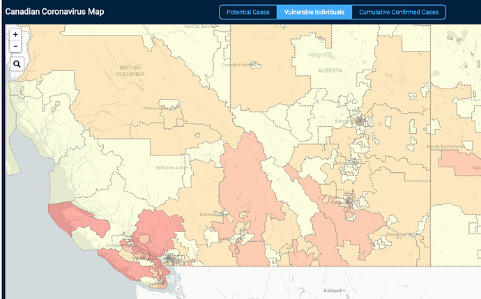
We chatted a little bit about capturing the same data north of the border (Canada!). Good news, a Canadian team has already tackled that issue. They’ve got things down to the postal code region, a similar approach you’ve taken with counties.

Sharing this on the premise that perhaps there’s some knowledge-sharing across the border that could take place. One idea would be to sync up the risk calculation between the two sites.

Again, nice work on covidcompare - I’ve shared it with a number of people.

https://flatten.ca