When we execute interp.plot_top_losses(9, figsize=(15,11)) we see an output like this
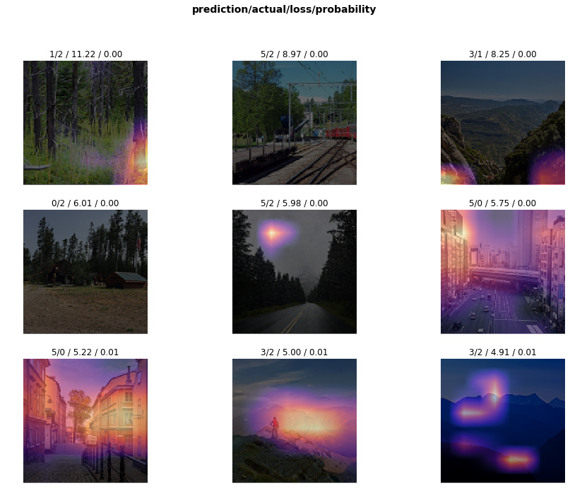
I wanted to understand more about it so I went through the docs which linked me to a research paper. I did not understand much from the paper but what I did was that there are various techniques to visualize what a model is picking up for particular classes and Grad-CAM is one of them which is used by fastai. These visualizations help us get an intuitive sense of how our model is performing. Am I right about this? Also, if someone can explain more about this technique then it’ll be really useful.
Finally, are there ways we can use this output to understand how to improve our model?
Any kind of useful information will be helpful.
Thanks