Topical Style Transfer

Here’s some style transfer results from playing around today, and accompanying thoughts for anyone interested.

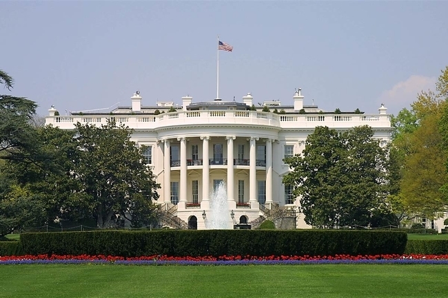
I thought it would be interesting to see if style transfer might work on extracting style from something like architectural design. St. Basil’s Cathedral in Moscow seemed a good choice for this sort of thing, given it’s color scheme and style. I arbitrarily selected the White House as the content image.

With content output at block3conv2:


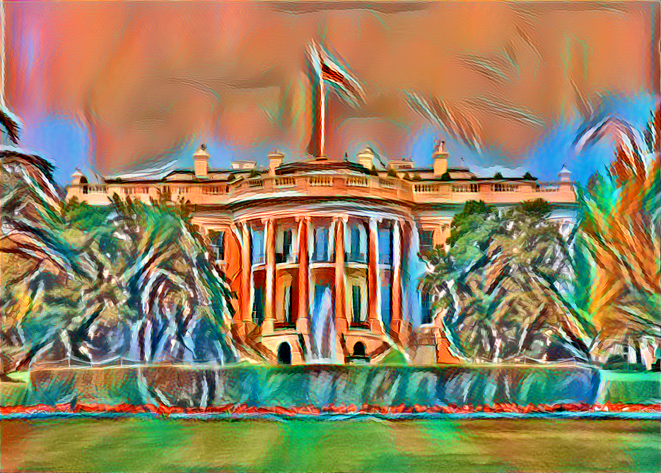
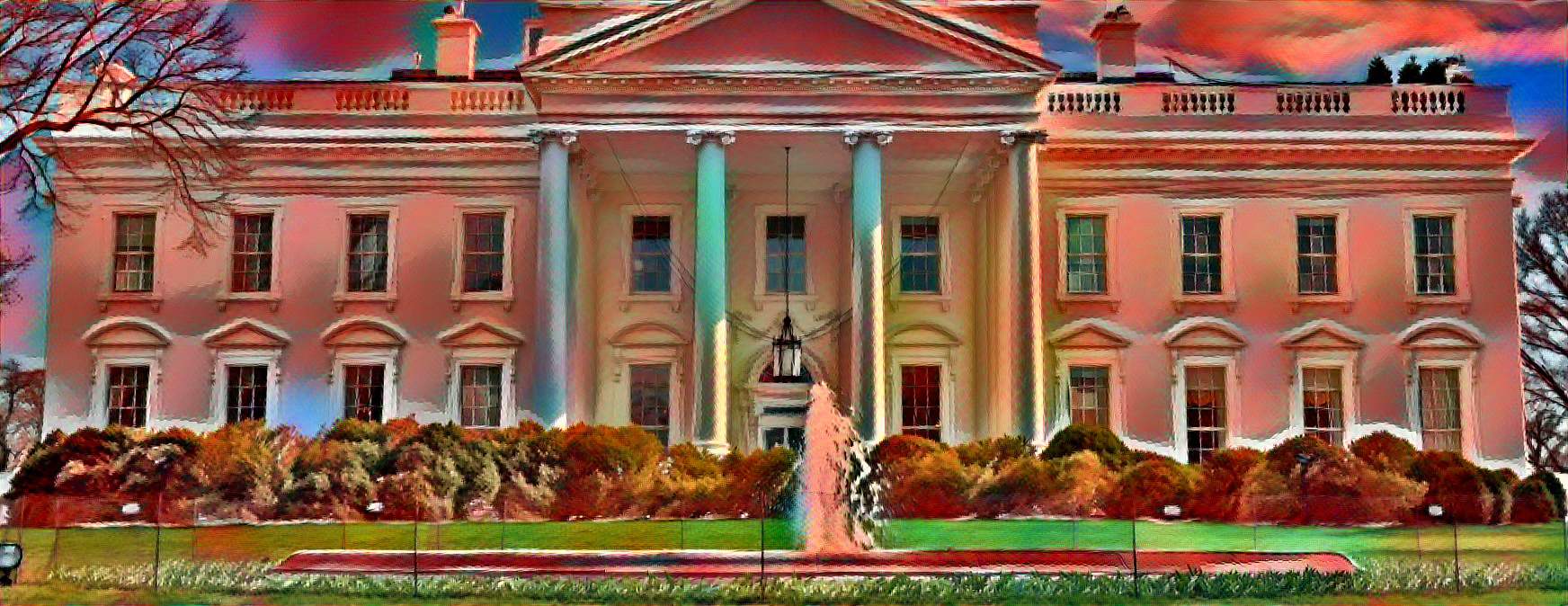
This simultaneously looks like a pretty pastel and a foreboding image, what with the red sky. The White House is still completely discernible, as well as the flag and lawn. The bushes on the left and right are quite “blobby”; it’s unclear whether we would know they were bushes if we didn’t already know that beforehand.

With content output at block4conv2

Still discernibly the white house, but content is looser here at a later layer. Slightly nightmarish, the skyline looks positively apocalyptic…

Neither of these gave any indication that the style transfer was incorporating any of the geometric color patterns, like the swirls on the domes. Here’s the deconstructed style:

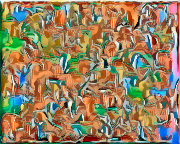
Has all the colors, and some of the “stripey-ness” of the domes. But not enough to really transfer those striping patterns. If I had to guess, I’d say it’s probably because the domes are small parts of the image.

I played around with a lot of different loss weighting/ content conv output combos for different images, and usually the best ones were block3conv2 with scaling 1/10 on content loss. Block4conv2 with no content scaling usually gave good results too, but much more “trippy”. The rest of the images have been done with the first scheme.

Here’s another one from a different White House image and a different image of St. Basil’s:

Equally spooky.

Moving on to style from art. In Jeremy’s examples during lecture, the one example that didn’t seem to work well was the Simpson’s one. This has been mentioned already, but I’m fairly certain the reason that particular style didn’t work so well was because with a cartoon, style transfer isn’t doing what we expect it should. When we think of drawing a bird in the style of the Simpson’s, that means completely re-drawing the bird’s edges and changing the content completely to look like a Simpson’s cartoon. The only “style” that defines the Simpson’s is their edges; everything else is flat color. Style transfer won’t do that with this kind of cartoon.

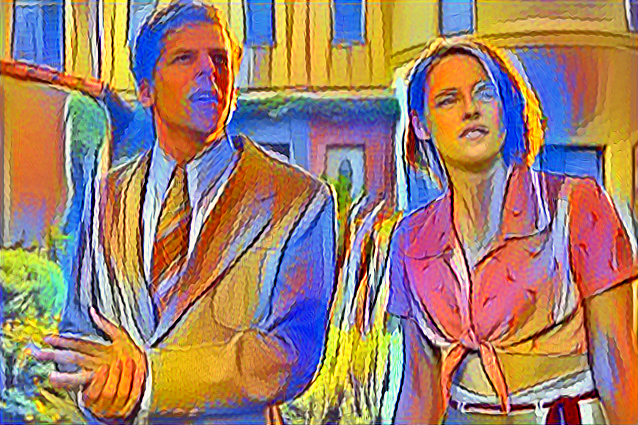
When I tried with a more textured cartoon:

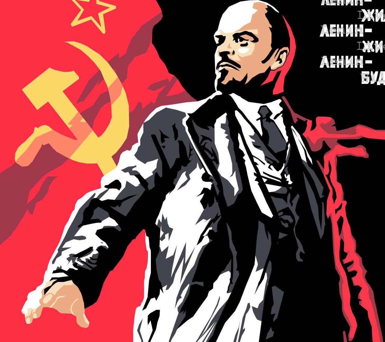
And applied it to POTUS:

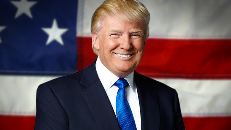
The result reflects the original cartoon style much better.

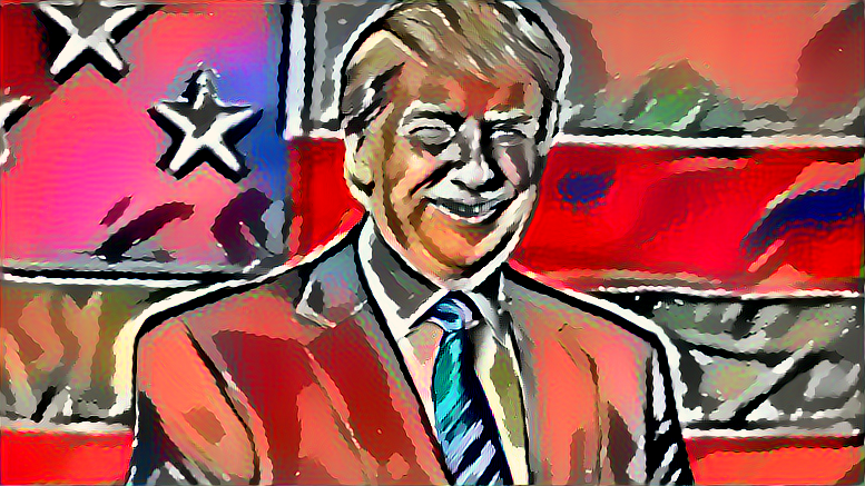
Specifically, notice that The Donald has the same white/black silhouette as Vlad. The folding in the flag and clothes are much more pronounced than in the original image, matching those in the cartoon. It really has accentuated the almost unnoticeable edges in the content image, turning them into hard lines.

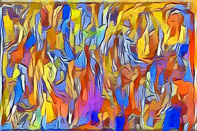
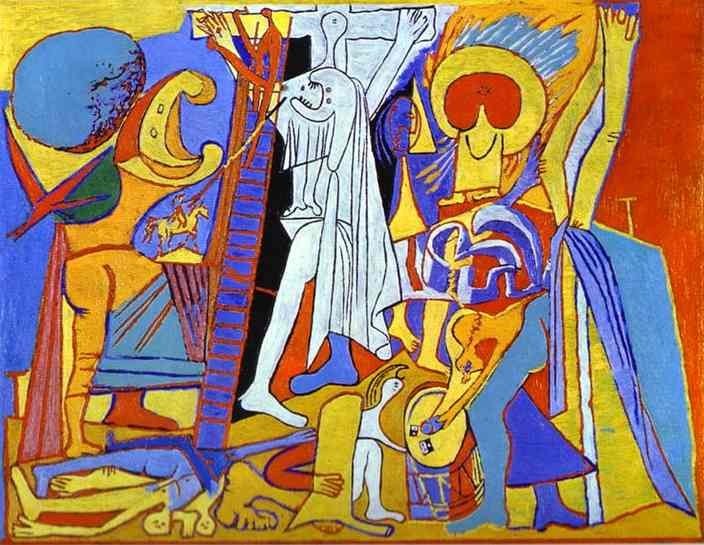
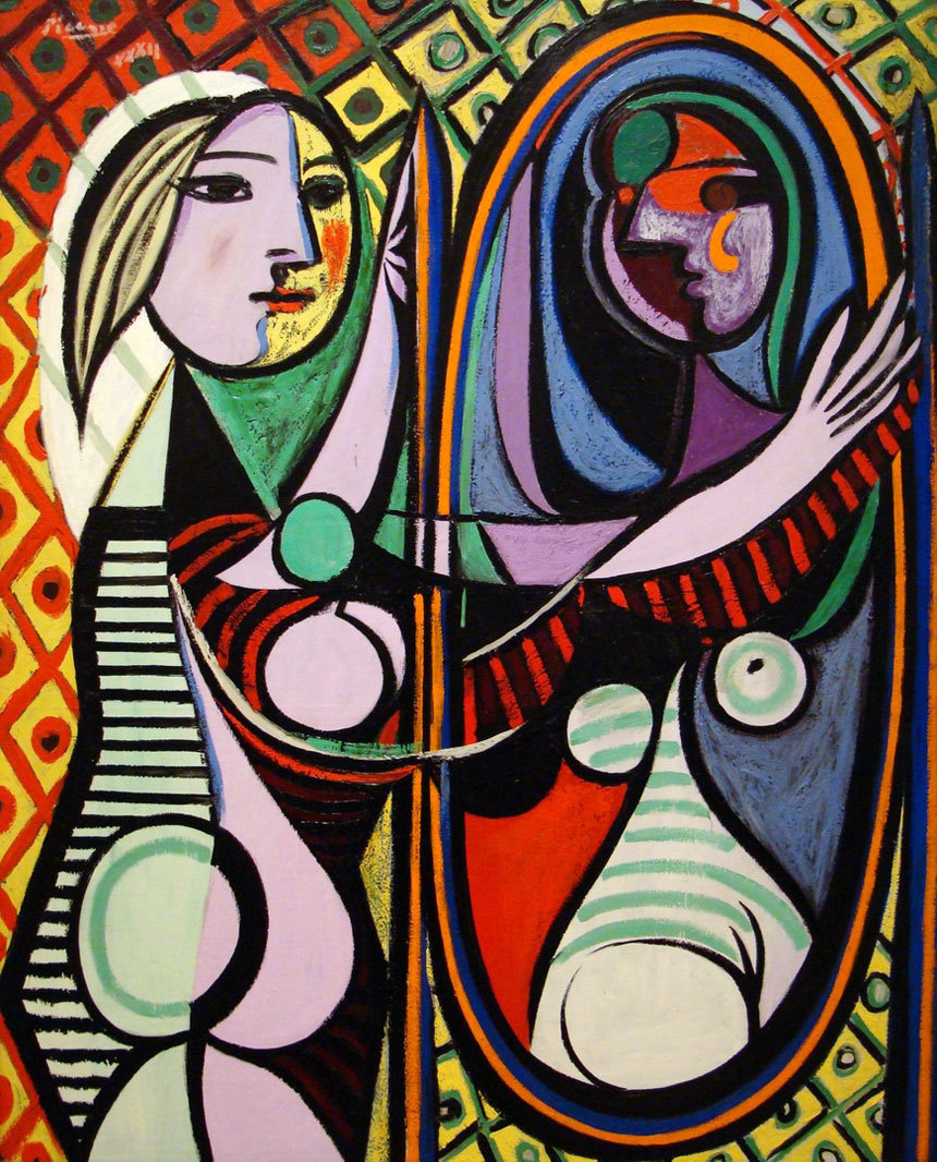
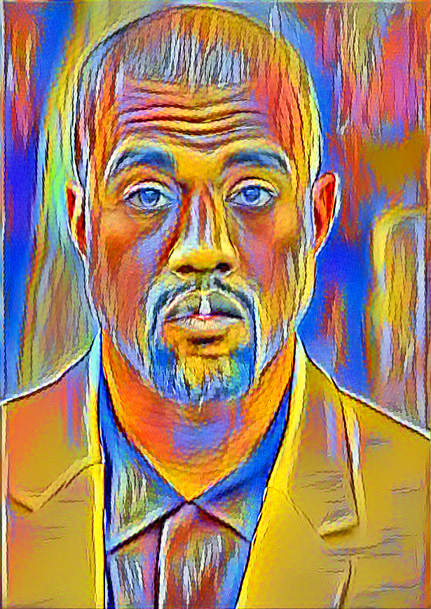
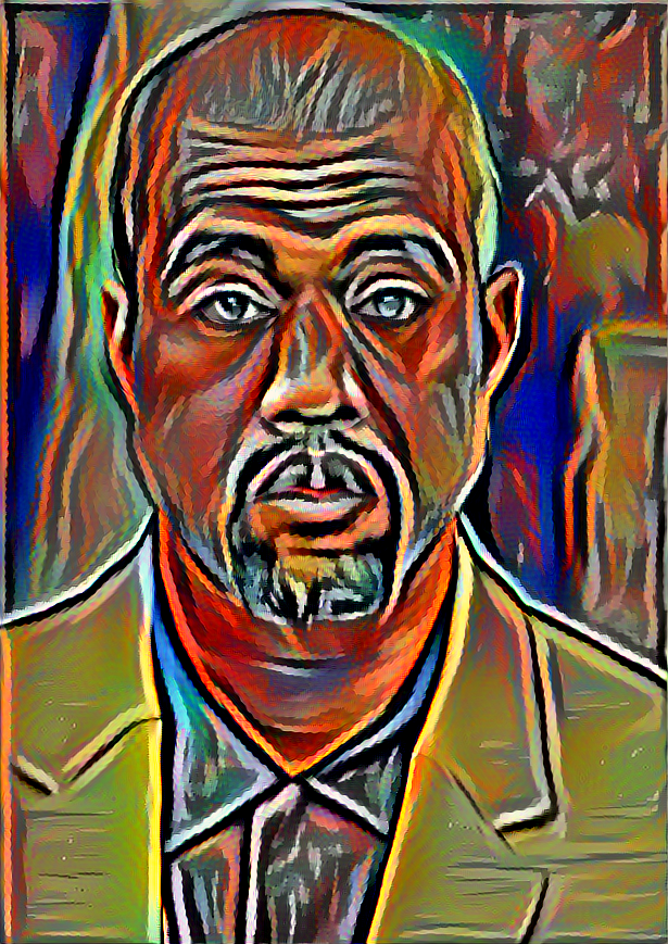
The best looking results I got though were predictably those from more impressionist images like Picasso:

Applied to Saint Pablo himself:
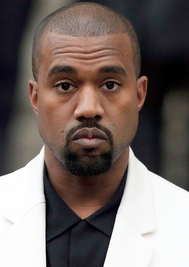
Results:

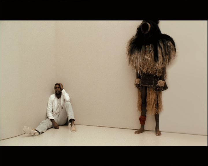
But I think what truly astonished me was how well style transfer worked on things that weren’t necessarily in the foreground.

I applied style transfer on a frame from the Love Lockdown music video:

And the result:

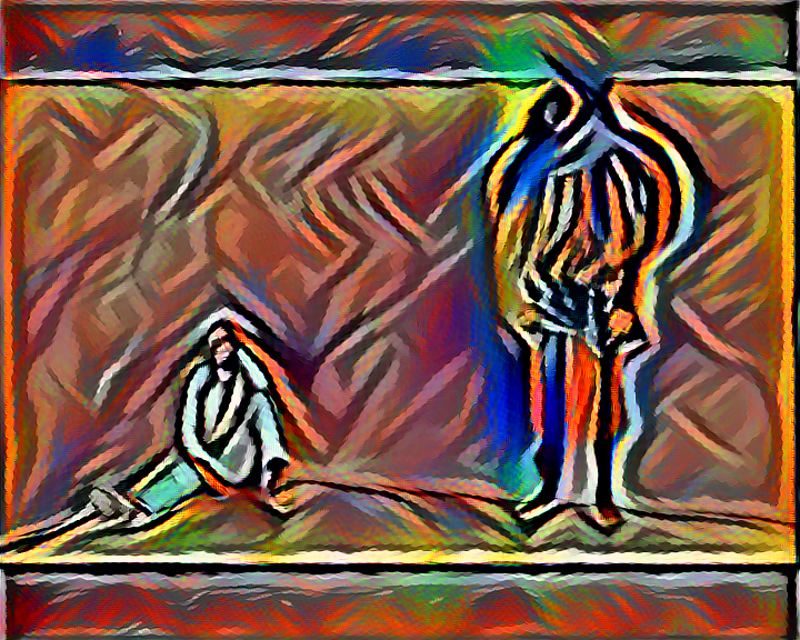
That really blew my mind. You can absolutely tell that is a man sitting in that corner, with what looks like less than ten brush strokes. The only clarity that’s lost here is the corner between walls he’s leaning in, which looking at the original image is almost impossible to see; and the finer details of the individual on the right. Everything else, the wall-floor edges, the framing, that’s all preserved.

I’m very interested in learning how to do this for a video. As of yet, there doesn’t seem to be an open source python implementation based off this paper https://arxiv.org/abs/1604.08610 , although there is one in lua.

9 Likes

cool, really love the picasso style on Saint Pablo! what’s the difference in the 2 images, did you use different content output? how many iterations did you use for the Love Lockdown music video? how long did it take?

The difference is I used the two different Picasso’s I showed for the style transfers onto Kanye. I did all of these images with only ten iterations, with content output from block3conv2. The time varied depending on the content image, as the output image was the same size. So sometimes like three minutes, sometimes much longer. I didn’t time them unfortunately :frowning:

wow, that’s impressive with only ten iterations. do you have a github repo for this work? would love to see your implementations.

I do not have a repo, but it is very much in line with the implementation in Jeremy’s notebook. I would play around with that as a starting point, and just try different images and tune the content layer output, as well as the scaling parameter for the content loss in the loss function.

Just changed the content output from block4conv2 to block3conv2. Huge difference in the output(see below). I am not sure why this is the case given block4conv2 is the later layer in the convolution and should be able to “see” better.

block4conv2

block3conv2

1 Like

No, this is the behavior you should expect. Think about it this way, the deeper you get, the more transformations are happening to the input. Therefore, the more the inputs can vary to achieve the same result at that layer.

Here’s a good way of thinking about it. Imagine a simple function f(x) = x + 5. I have two inputs, a and b. If f(a)=5, and f(b)=f(a), then the only possibility is that a=b=0. With this simple of a function, there is no flexibility for the inputs to vary if they have the same output.

Now imagine g(x)=x^2. Then let’s consider the composition g(f(x))=(x+5)^2. Let’s say g(f(a))=25, and g(f(b))=25. Now, there is some flexibility; if ‘a’ is ‘0’, b can both be 0 or -10. This is an example of a more complex function having more flexibility in the inputs.

Analogously, block4conv2 is a deeper layer and therefore a more complicated transformation to the input then block3conv2. As a result, using block4conv2 will give an image that isn’t as strictly representative of the content image as using block3conv2.

5 Likes

Also great movie

Also I find that when using block4conv2, if you remove the scaling parameter 1/10 and replace it with 1 you’ll get a much stronger content signal that has more style than block3conv4.

That was really well put @bckenstler, thank you for taking the time to break it down so clearly. It help me understand the content transformation in style transfer. It also helped me understand cnn better, for example, why more complex architecture tends to overfit, why removing layers might help with overfitting. I had a basic understanding of those ideas, with your explanation, I can approach it with a new context and a different angle. much appreciated.

just tried out this new configurations and it works. better result with stronger content signal and more style. I was about to conclude style transfer works only with certain styles, now i am back to experiments. what’s your secrete in tweaking parameters?

No secret, just play around with them! Personally, I find that adjusting the content layer will change how extreme the style is, and if I want a more extreme level of style but a discernible content then I might increase the scaling factor. Your best bet though in understanding the relationship between the two is to read the paper on it here https://arxiv.org/abs/1508.06576

@bckenstler

This person used style transfer on video for a boot camp final project with pretty good results. You can see his code here:

1 Like

I am also interested in doing this for video and possibly expose the end point on web/phone for people to play around with their own videos. Will try to get started on it today if possible.

Looking forward to seeing that!