The "colorful" dimension

TL;DR
The idea of the colorful dimension is to express with colors the mean and standard deviation of activations for each batch during training. Vertical axis represents a group (bin) of activation values. Each column in the horizontal axis is a batch. The colours represent how many activations for that batch have a value in that bin.

image

NB: Actual plot shown by Jeremy in the lesson are much more curated and focused. This post is about the original idea and my attempt to implement it.

DISCLAIMER: in the chart above I’ve manually superimposed the mean on the colorful dimension, to give an intuition of how the charts works.

THE GOAL
Looking at the plots of notebook 06:

Jeremy asked us to find a “fancy” chart able to capture the distribution of activations during training.

THE IDEA
Use the colorful dimension to visualize the distribution of activations during training.

The final plot for each layer is made by stacking the histogram of the activations from each batch along the horizontal axis. So each vertical slice in the visualisation represents the histogram of activations for a single batch. The color intensity corresponds to the height of the histogram, in other words the number of activations in each histogram bin.

CODE & EXPERIMENTS

The notebook is the first attempt to solve the problem

FUTURE WORKS
Try to have an understanding of what is going to happen looking at the charts.
Adapt the original callback to current fast.ai version to make it available.
Publish all the flash cards :slight_smile:

CREDITS
Thnx again to @jeremy for credit and to @simonjhb that helped me a lot on understanding the problem and transforming sketches into code :wink:

57 Likes

Thanks Stefano for bringing a ‘colorful’ dimension to our deep learning study! Your drawings are fantastic and it would be great if you could find a way to publish all of them as a learning resource.

2 Likes

NB: to make the notebook works, copy it in the same folder of other notebooks of part 2/2019.

Wonderful visualizations @ste !

Small suggestion: it would be great if you could add to the right of each plot a vertical “color bar” that shows the numerical value of the counts corresponding to each color bin. That way we could have an idea of how many activations are zero, etc.

4 Likes

More on the colorful dimension:

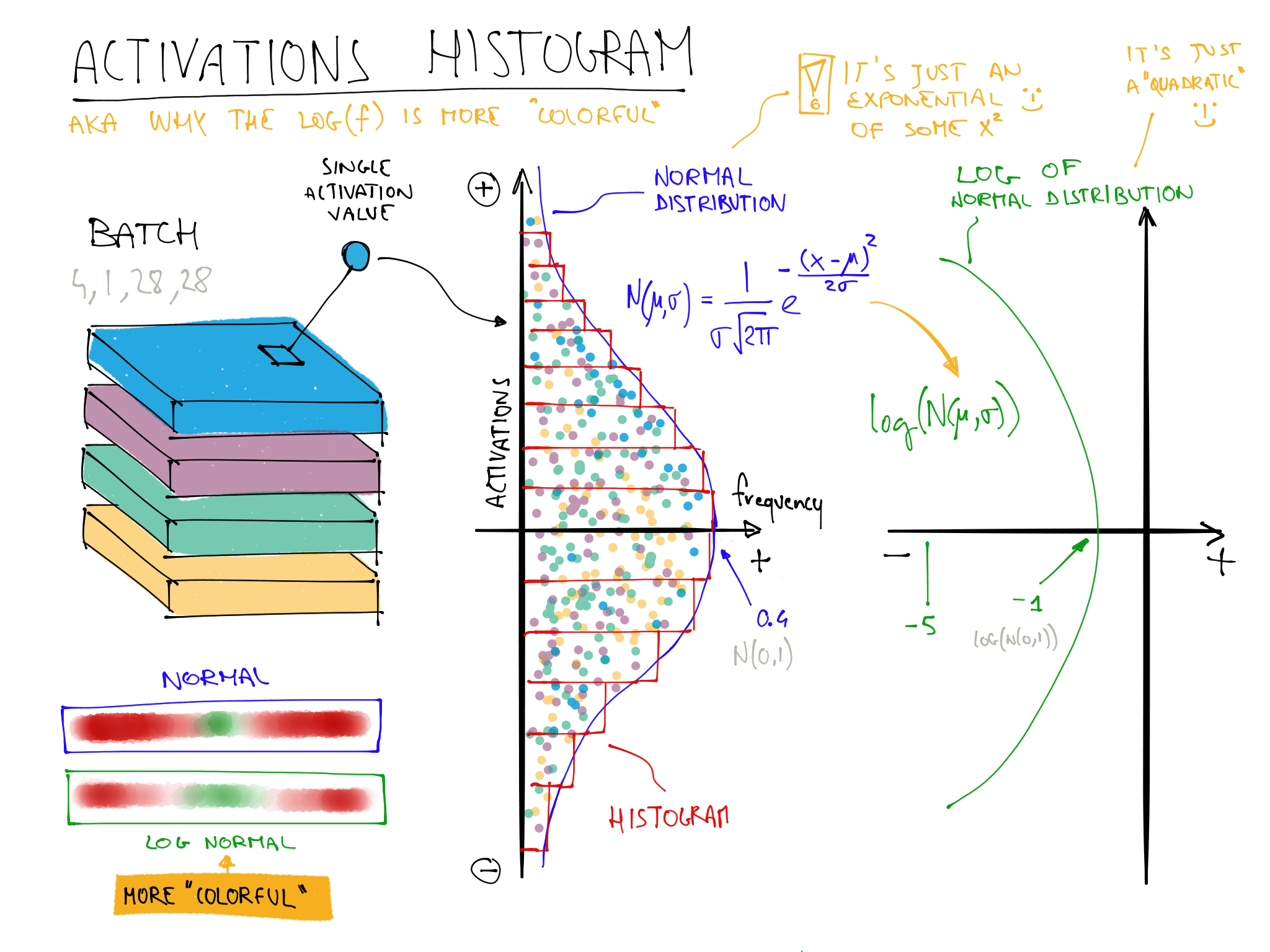
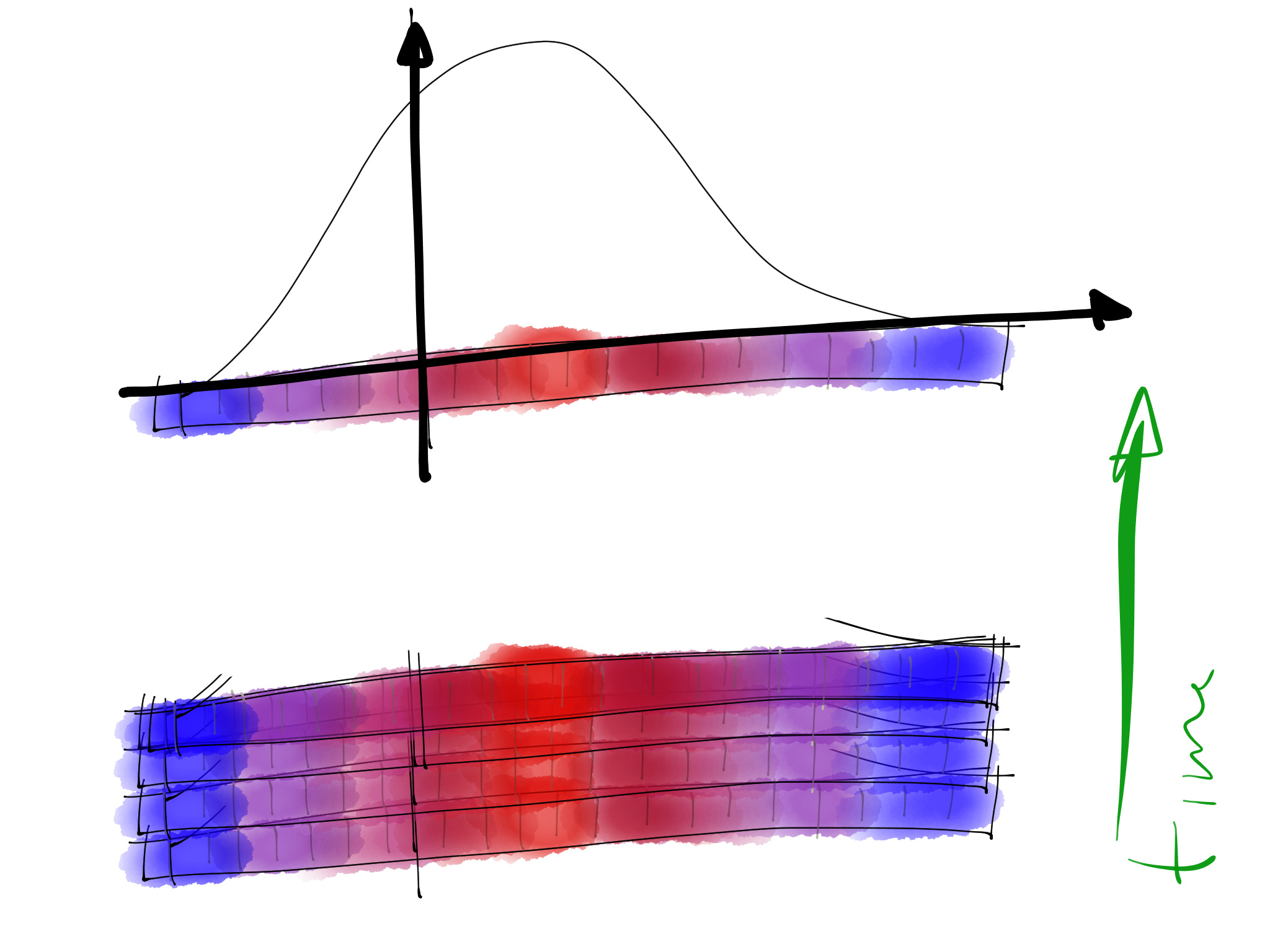
The following picture shows the steps involved in the computation of histograms. All these steps are needed to create a **single chart column", such as the first column of the chart is the histogram of the first batch and so on.

  1. GET A BATCH OF ACTIVATIONS: we usually analyze the activations after a specific layer/transformation. The generic shape is [BS,??]. For example the result of a 2d convolution is [BS,NF,XX,YY], and the result of a Linear layer is [BS,NF] where:
  • BS: batch size.
  • NF: number of features/filters/channels.
  • XX,YY: size of “image”.
  1. COMPUTE HISTOGRAM: we compute the histogram of the whole activations batch. The parameters of our histogram are:
  • hMin,hMax: minimum and maximum values reported in our histogram.
  • nBins: number of bins, the “resolution” of the histogram.
  1. LOG THE HISTOGRAM: Note that this transformation is made only for visual purpose and not applied to the stored histogram values.

Original Idea:

This was my very first sketch made to visualize the initial idea of the “colorful dimension”.

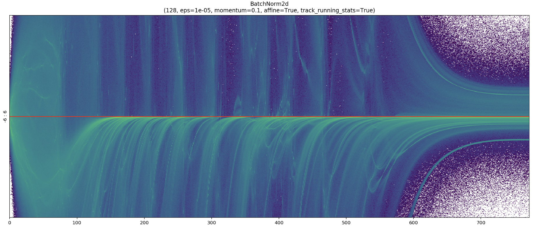
Some anticipations on the next post:

I’m working on a complete rewrite/improvement of the colorful dimension chart.
Here are some anticipation (this picture usually means bad training, but it’s cool :wink: )

12 Likes

I’ve just released the first version of the Colorful Dimension and the new Twin Peaks chart.

The Twin Peaks Chart

twin_peaks_chart_live

The Colorful Dimension Chart in two lines of code

data = ImageDataBunch.from_folder(untar_data(URLs.MNIST_SAMPLE),bs=1024)
# (1) Create custom ActivationsHistogram according to your needings
actsh = partial(ActivationsHistogram,modulesId=None,hMin=-10,hMax=10,nBins=200) 
# Add it to the callback_fns
learn = cnn_learner(data, models.resnet18, callback_fns=actsh, metrics=[accuracy])
# Fit: and see the Twin Peaks chart in action
learn.fit_one_cycle(4)
# (2) Customize and Plot the colorful chart!
learn.activations_histogram.plotActsHist(cols=20,figsize=(30,15),showEpochs=False)

You can find the article and the code here:

12 Likes

Bad training looks freakin’ cool!

7 Likes

@ste we like these pics so much that we’re putting some of them (with credit, of course) in our book! Thanks so much for the great material :slight_smile:

11 Likes

Thank you Jeremy for the opportunity to be part of this: I’ve got one more reason to be thrilled about the book :wink:

4 Likes

Wow these visualisations are beautiful! Does it work with fastai2?

Yes, it’s ActivationStats.color_dim() in fastai2

9 Likes

Hello everyone,

Thanks @ste for your visualization diagram.

Could someone help me to understand the histogram better? I have used the model from lesson 10 and attached the result.

nn.Sequential(
       nn.Conv2d( 1, 8, 5, padding=2,stride=2) ,nn.ReLU(), #14
       nn.Conv2d( 8,16, 3, padding=1,stride=2) ,nn.ReLU(), # 7
       nn.Conv2d(16,32, 3, padding=1,stride=2),nn.ReLU(), # 4
       nn.Conv2d(32,32, 3, padding=1,stride=2) ,nn.ReLU(), # 2
       nn.AdaptiveAvgPool2d(1),
       Lambda(flatten),
       nn.Linear(32,10)
   )

learn = Learner(draw_data, draw_model,loss_func = nn.CrossEntropyLoss(), opt_func=optim.SGD,callback_fns=actsh,metrics=[accuracy])

learn.fit(3, lr=0.6)

learn.activations_histogram.plotActsHist(cols=12, figsize=(20,10), showEpochs=True)

I can’t understand:

  1. What do black and yellow lines mean in each layer?

  2. For instance in the L2 Conv2d for epoch 2 and epoch 3 the magnitude distribution of activations far more than the specified display range of -12 to 12. Does it mean that such activations can cause gradient explosion during the backpropagation stage?

  3. In L4 Con2d the magnitude distribution of activations starts to grow from iteration to iteration, does it mean that the network started to learn in later iterations?

  4. What kind of insights should I get from this hist? What is a healthy color should be for each layer? How to analyze this diagram in general?

  5. Is there a list of similar diagrams and tools to analyze neural nets’ performance which commonly used in the production environment for PyTorch / fast.ai infrastructure?

Thanks,

I’m really curious about this, has anyone tried to port this over to Pytorch Lightning?