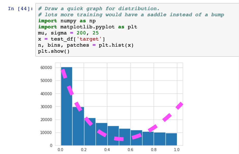
During predictions, I am arriving at this graph. Now I would expect for a binary classification to fit more on the curve in pink. Even after extended training on a model, a graph like this appears. Am I overthinking it o Could it have something to do with my Y range?
hi difficult to comment on a graph with no info about the information displayed