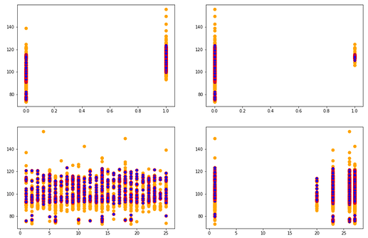
In lesson 2 for Intro to ML, Jeremy asks to get an intuition of what good/bad prediction means. I tried to plot my actuals vs. predicted value for each feature on a Kaggle dataset.
The code used for the same is -
plt.figure(figsize = (15,10))
colslist = ['X314', 'X315', 'X8', 'X5'] # top most imp features
for i in range(1,5):
    plt.subplot(2,2,i)
    plt.scatter(X_valid[colslist[i-1]], y_valid, s = 50, c='orange')
    plt.scatter(X_valid[colslist[i-1]],m.predict(X_valid),c='b', s=50, edgecolors='r')
@jeremy I was wondering if the following insights can be drawn from the graphs that I see -
- The graph shows the distribution of y against a specific feature (in orange) and the red dots gives the distribution of our predictions for the same feature.
- From all the 4 graphs, it is evident that the value of y between 80-90 has not been captured completely in our prediction algorithm (m).
- The random forest algo doesn’t make predictions greater than 120 and considers them as outliers?
