Hey guys, I have a somewhat goofy request. I need to make a cool-looking picture of my basic ANN for marketing purposes. I was thinking something like graphing the activation functions of the individual nodes or something stupid like that.
I know it sounds dumb but doing something similar has worked for me in the past. We were talking with some investors a few years ago who were on the fence about partnering with us. They were unwilling to make a final decision, but what ended up selling them was when I took one of their datasets, made a NN (back in the pre-tensorflow era), and printed out the weights of each node into a giant text file after every epoch. They were so impressed by the “AI” that they finally said Yes to us.
Anyways, if anyone knows a tool or has any ideas, it would be much appreciated! Ideally something like this, but really anything looking “sciencey”: https://arogozhnikov.github.io/3d_nn/
It’s about the concept you like to display, I created a heat vision that is plotting the active region of the input image based on the weights of the one layer to check how it is considering the input image for the different set of output class. I strongly agree with your point, strong visualization always steals the show, As of now, you can consider d3.js and OpenGL or the best of data visualization. There are a lot of SVG based tools which you can use it for extreme graphics like what you have shown.
The visualisation depends on the type of ANN that you are working with.
Some 'cool & sciency" visualisations that I have found are:
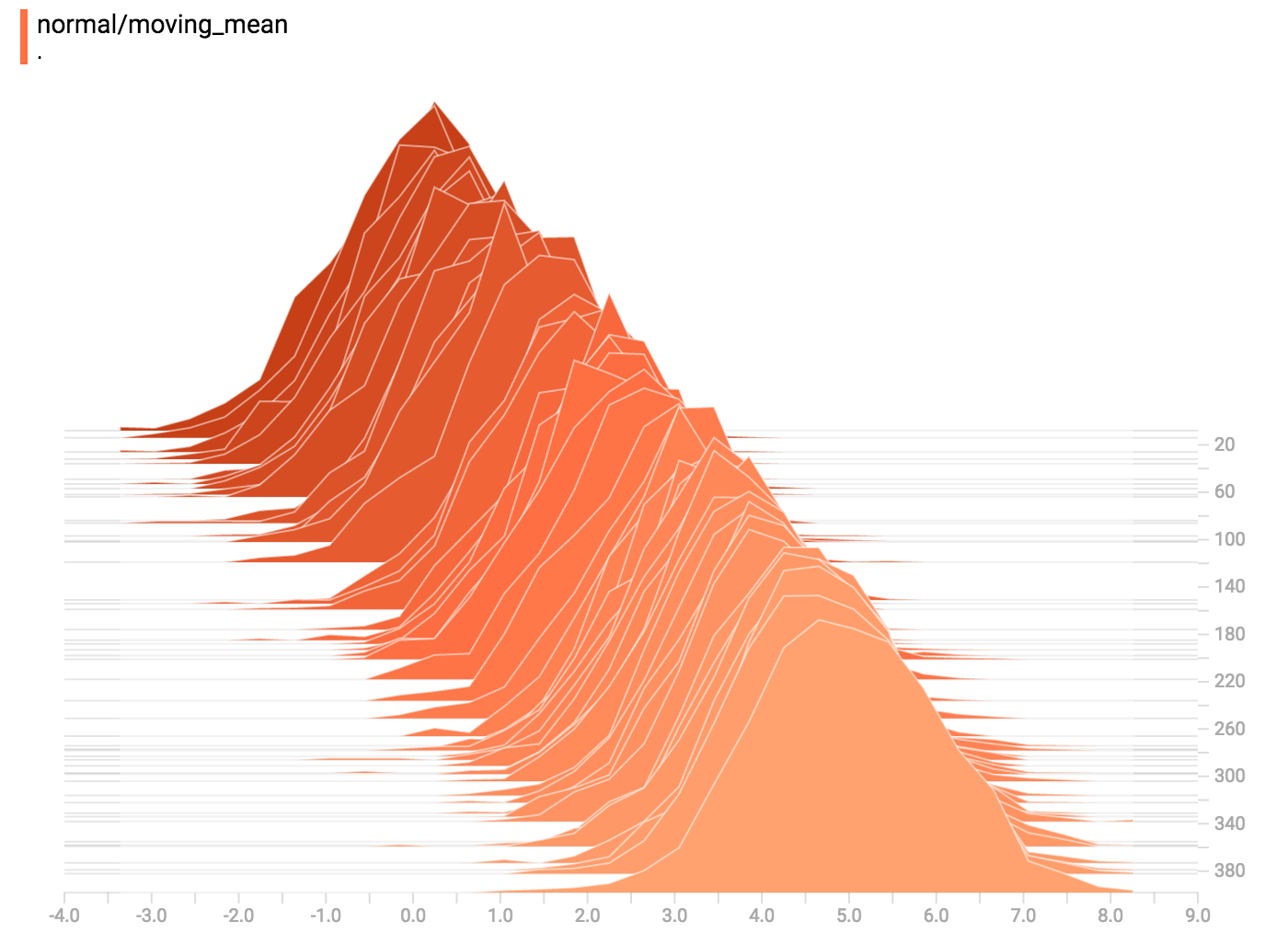
tensorbord NN weights histogram visualisation. Tensorboard also has other cool visualisations. E.g. I wrote a wrapper around tensorboard to ‘sort’ my images :