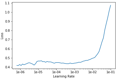
I am a new user of the fastai library. After watching the second week’s video I wanted to classify my own dataset of 29 classes of signal images. Yet, after following the instructions and plotting the lr curve to decide the best interval of lr values I got the following graph:
Which is not exactly what I was waiting for… there doesn’t seem any steep really…
what do you advise me to do in this case?
Thank you @mrfabulous1 for such a response! WIll do! also, specifying the interval of lr to plot gives a better view of the curve.
Hope you are having a fab day!