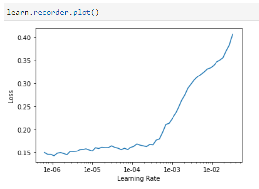
I’m working on building a classifier to detect whether an image has been deepfaked. I’m using smallish sample and a resnet34 image classifer to get a baseline. The graph that I get from the learning rate finder is the following:
How should this be interpreted when trying to get a decent learning rate/improve the model? Some ideas that I had are:
- It’s just not capable of learning anything with no more information as to how to fix that
- The model is not complex enough and trying a resnet152 might help
- There is not enough data and more data would help
- The data is too noisy and more data wouldn’t help but helping the model out by cropping out insignificant parts might help
- It is learning and I just need to find the location on there where it’s the learning the most even if it seems to be pretty miniscule
Are any of these interepretations correct or is it something else?
Thanks