Football Transfer case as an example of Feature Importance and Partial Dependence in tabular models

As I realized that I’m not able to make article in English out of my experiments (if anyone would like to be a coauthor to make one I will be grateful), I’ve decided to show it as a post at least.

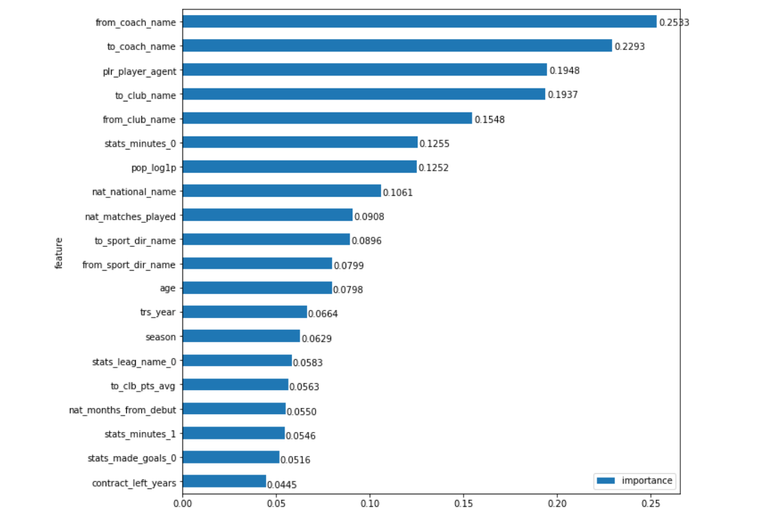
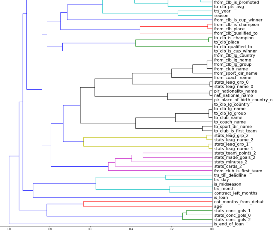
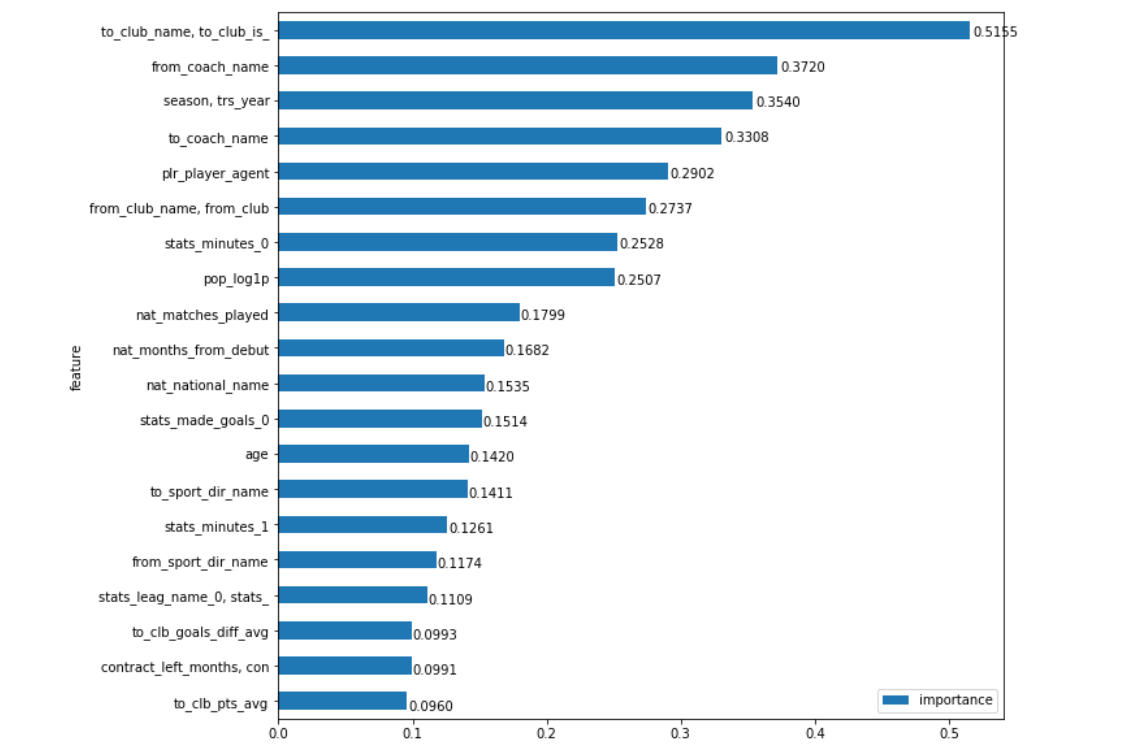
Most of the techniques how to use Feature Importance (FI) and Partial Dependence (PD) in fastai I’ve described in this post. Here I’ve summarised and refactored all the specific code.

Intentions

Number of mounths ago I’ve made some functions to implement Feature Importance and Partial Dependence for fastai tabular models (as Jeremy suggested in his Machine Learning for Coders course). To be really sure that my approach does work I had to find the area of my own expertise that is open (so no data from my job) and can appeal to wide audience as, to my mind, best way to ‘sell’ a technique is to show it in a good example.
The search took some time, but as soon as I have found this amazing set of football transfers data, I knew this was it. This data contains wide variety info on (European) football transfers of 2008-2018. So I’ve made my choice.

Unfortunately I’ve no insights how to make a link directly to a cell in a notebook on github. So, in addition to the link, I will provide cell execution order number. I realize that it’s much less than ideal, but it’s the only way I could think of.

Model

The first step in making FI and PD is creating a model (tabular NN-model in our case). In fact, as Jeremy said, it is not have to be ideal to do the job. But nevertheless I’d like to have some anchor point to compare with.
In terms of football transfers there is only one acknowledged source its transfermarkt.com Fortunately it not only have what they call ‘market value’ of each major player, but it also tracks this value so anyone can compare it with the real transfer money this player was payed at that particular time. I am aware that transfermarkt doesn’t claim ‘market value’ to be the real transfer value in a particular situation with the particular clubs, but everybody use it that way and to be honest there are no other reasonable options.

So I’ve made a model in a pretty straightforward fastai-way. Not much to say here except:

  • my depended variable (‘fee’) has been logorythmed down as usual
  • the fact that I’ve tried many variants of hyperparameters in other notebooks and stick to the ones that fit well
  • I’ve used some exotic exp median absolute percentage error as my accuracy meter. Why is that? It’s just the mathematical formula of my intentions what good transfer accuracy should say. For me it’s the answer for a question: what percent most probably (median) will my mistake of fee be if I would try to predict it with a model
  • I’ve used Median Absolute Error as my loss function as it is closer to my accuracy function. Also I don’t really want to use MSE here as it prefer to fix the extreme cases more (because of the square). And it the case of very limited number of features (transfer value is hugely depended on the things that are outside of the data) we would have a lot of outlines and this is fine

So that is the result?
The model predicts the outcome with (my weird type of) error of 35%.
(Remember its exp_mmape we are talking about and it was calculated along the samples all over the 2008-2018 period not for lastX records as we would test it in case our goal will be to predict, not to analyze).
Ok, how good is that?

I’ve made a separate notebook to calculate that. And the final score is the following

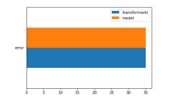
transfermarkt error is 35%
my model error is 35%.

To be honest it’s very weird that error is the same. I still have a feeling that I miss something (even though I’ve checked it a number of times).

But the ultimate check that I did not mess it up and calculated the same thing 2 times is the fact that these predictions are independent.
I’ve averaged prediction from model and transfermarkt and got an error of 32%

Nice so far.

I just want to stop for a second and think about that fastai is capable of.
I’ve found some data of football transfers, put it directly to tutorial-like approach and got the same results as multimillion-site, that is powered by crowd effect as well as by best experts in the field. I also want to mention that these experts work on much more wide data that is not available for the model (which knows nothing about football, transfers and etc.). And yet result is the same. (And if we take into account that model can also predict the loans, it performs even better).

That concludes my fist post as it is already pretty big. I will continue with Feature Importance, Partial Dependence, feature closeness and etc. in a couple of next posts (I will add some blank post for it).

2 Likes

Feature Importance

There are 2 possible ways to calculate feature importance.

  • Train a model with all the features, calculate accuracy. Then train it without one particular feature and calculate new accuracy. Do it for every feature. As a result comparing differences in accuracies will show you relative importance of the features.
  • Train a model with all the features, calculate accuracy. Then shuffle data in one particular feature and calculate new accuracy. Do it for every feature. As a result comparing differences in accuracies will show you relative importance of the features.

As we can see the difference is in ‘retraining the model’ vs ‘shuffling data for the same model’. The second way is way much faster (as it doesn’t require retraining), but the first one seemed to me to be more ‘honest’ (as we test the situation of not having this data/feature at all). But my experiments showed that the first method appeared to be very inconsistent. It needed many cycles of retraining even for one feature, and still produced unstable results.
So I’ve decided to stick with the fast ‘shuffle’ method.

To calculate Feature Importance we can use function calc_feat_importance from my set of functions. It’s just need to know what your dataframe is (df), your learner (learn), dependent column name (dep_col), accuracy function (func) and batchsize (bs). Another argument is number of rounds (rounds) as function reshuffles column several (round) times and then averages the calculated accuracy for consistency.
The output of the previous operation (ordered dictionary with pair feature – relative importance) can be plotted with plot_importance

Ok, let’s go back to our transfer data. What FI would look like

That looks reasonable. The features I presumed to be more important are among the top. But my gut tells me that I should go deeper.
Why from_coach_name (name of the coach of the team that sells player) is the most influential feature? And clubs are only on 4th and 5th places, why is that?
And then I was starting to think about how isolated features are. I’ve made a dendrogram of features’ closeness.

It’s easy to see how 'from_club_name', 'from_clb_lg_name', 'from_clb_lg_country', 'from_clb_lg_group' are close to each other. That’s no coincident. Model dissipate club’s importance on all of these features. On the one hand it allows us to determine the importance of club’s league ('from_clb_lg_name', 'from_clb_lg_country', 'from_clb_lg_group') separated. But in the most cases we are interested in determining how important the Club itself is and in real life it contains not only club name, but all the features it has (leagues included).
And there is a number of such ‘connected’ (highly correlated) features’ cases, like season and transfer year (season and trs_year) or player nationality and place of birth country name(plr_nationality_name, plr_place_of_birth_country_name) and so on.
Full list of ‘connected’ features is in cell 34
To process ‘connected’ features we can use another function calc_fi_custom which takes additional argument fields – a list of features/connected features to test with

That is much better. Club-buyer now is the most influental feature, by a large margin. It feels right to me now. Price for the same player with the same statistics is very determined by type of club (top-club, ‘chinese’ club, portugal ‘greenhouse’ club and etc) he was bought.
The year of transfer ('season, trs_year') is also one of the most important features (prices for players inflate much in the recent years).
Player agent ('plr_player_agent'), player’s time on the pitch in last season ('stats_minutes_0') and his popularity in social media ('pop_log1p') are among our top8, it is also very reasonable.
The most unexpected thing for me is how high model ranks the coaches: to club ('to_coach_name') is the fourth and from seller club (from_coach_name) is even higher – the second place.
Is it just a consequence of the fact that club and coach are very correlated (it’s not a rare case here that coach appears in one club only) or it’s much more insightful on the role coaches play in developing/showing players skills (and as a result in their transfer price)? It looks like a good field for further analysis.
On the other part of a spectrum (least important features) everything is as expected. Except maybe dominant foot. In real life left-footed players are considered to value more. Which is not the case for our model. Maybe it’s just a ‘professional myth’ :slight_smile:

So you can also apply this method of calculating Feature Importance to our own data to understand it more and to make more effective decisions on it.
I mean if you know what (feature) effects you result the most, you can concentrate your efforts on it to gain maximum effect.

2 Likes

This post will be more on results and less on exact code to reproduce it (which is here by the way) as the complete partial dependence dataframe is calculated by once calling a function get_part_dep and the rest is just a matter of filtering and plotting it.

Method

What partial dependence is?
In short it shows you how ‘important’ not the feature itself is, but how particular value of a category affects the dependent variable. For ex. we can determine at what players’ age transfer fees are the biggest. It looks like we can get this info directly from data (without any model). We just make a plot Age vs Fee. But it won’t be the ‘clean experiment’. Because in general players at age of 27 have much more matches played, goals scored, social media promoted and etc than those at the age of 17. And it’s hard to separate these features. What we really want is to calculate importance all other features being equal.
How can we do that? When we have a model, we can make an experiment. Let’s take all our data and set the age column to 17. Now we have a bunch of data of what will fees be for every transfer for this particular Age. And we can take median across all of the results. It will be a median price for age of 17 (for this set of data). And then we repeat it for every age (from 18 to 36). Comparing these medians we can determine what particular age influence transfer fee the most.

Age

That’s the plot of age vs transfer fee on the source data itself

And that’s the partial dependence of a feature


First plot seems to be much more familiar as it’s a common (football) knowledge that age of 27 is the peak of players’ transfer value. But as I’ve showed in intro, it’s not because of the age itself, players’ stats are growing too. A player 19 of age will definitely cost more than the same player (from the same club, with same number of matches, goals and followers and etc) with the age of 27.

Season

Here we can explore how model ranks particular years, and how ‘exponential-ish’ last part of the plot tends to be

On the next few plots value inside the bar (an the bar color) represents the number of particular transfers in the dataset.

To club

Here I’ve used the same principle of ‘connected’ or related features from the previous post.
The higher value right of the bar, the more part of a transfer fee will depend solely on who buys this player (the higher – the more ‘ovepayed’ transfer is).

18 of top 20 are English Premier League (EPL) clubs here. With an addition of Real Madrid and Anzhi “Party Like A Russian” Makhachkala (which is dead now by the way)

From club

These are clubs which are able to sell players more expensive than the market average

It’s not an accident to see here Shakhtar (a lot of transfers to top-clubs in the last 10 years), Benfica (maybe the best seller in Europe, with most number of transfers here) and Sevilla (Monchi), but Atalanta is the most interesting cas , which is derespirely needed of exploration. Cases like Atalanta’s are the real jewels here. The cases that are not so obvious that provoke to look much closer to it and to explore these underappreciated clubs. But further exploration itself is not the reason of my post, so we move on.

Club’s effectiveness

If we have clubs that can sell and buy, we can calculate the ratio between buying and selling price. I just need to remind you that this ratio shows how the ‘club brand’ itself raises (or lowers if ratio is below 1) player’s price. But it’s just a ratio, it doesn’t show who earns more on transfers in absolute values.

All four portugal top-clubs are here. Belgian clubs are also among the best (mostly because of low buying price) and Anderlecht is the most notible one with 110 transfers overall. Besiktas, Dinamo Zagreb and Trabzonspor surprised me by being here.

Most ‘uneffective’

What can I say. Top-clubs being the top-clubs. They are not in the business of raising the players value, their concern is to transform player’s best years into twitter followers, goals, points and titles. So Man United can buy any player for any price and not bother themselves with the problem of selling him with at least at the same price.

League

We are also able to determine importance of a Leagues alone

Yes. EPL is very overpriced. In fact according to this plot it is more overpriced that all other top6 leagues combined.

From coach

Who can sell the best of them?

Simeone is the best. Period.

Agency

The last plot will tell us about players’ agents. Who’s client football player should become to get the most salary (or to be true the most transfer fee)

I must say that: Jorge Mendes (Gestifute here) not only has excellent players like Cristiano Ronaldo, but he is able to sell them as no one else in the world. Mino Raiola no match for him, despite all the PR efforts.

See you

That concludes my long post and if you happen to know russian you can check my even more detailed post on this topic.

1 Like

My last post on this topic will be about dimension reduction.

As we use vector (which is just an array of floats) length of 20 to represent each value of categorical feature we could theoretically put it on 20-dimensional’s plot (20 floats for 20 axis), but it’s hard to reproduce it on a 2-dimensional monitor. So we can calculate 2 axis in such a way that they are the best to represent 20. It can be done in 4 calls:

Getting all the embeddings from a model
emb_map = get_embs_map(learn=learn)
Reduct dimensions (I prefer to use PCA which is built in pytorch)
redc_emb_map = emb_map_reduce_dim(embs_map=emb_map, outp_dim=2, to_df=True)
Add times column (to be able to filter on it)
redc_emb_map = add_times_col(embs_map=redc_emb_map, df=df)
And, finally, plotting
plot_2d_emb(emb_map=redc_emb_map, feature='to_clb_lg_name', top_x=30)

How to interpret these plot?
I prefer to cluster the values and point out the outliners. Outliner here represent that this feature value is somewhat very different from the others in terms of transfer fee. Distance between points is also a valuable measure. The further away points on the plot are the more different they should be.

From club
Here is the top 30 values of from_club_name

Benfica, Porto and Sevilla are clearly form donor-club cluster. Barcelona is the outliner in terms of selling players.

To league

EPL is a clear outliner here (and it is very much true in real life). Belgian league (Jupiler Pro League) looks like the opposite of what EPL is. Portugals (Liga NOS) also have their unique way here (after all it’s a plot on selling players). And the most similar to turkish league (Super Lig) is surprisedly Netherlands (Eredivisie).

Agent
Here you can check what agency to choose if you want to be a client of Jorge Mendes, but cannot afford it (and you go with something similar)

Position
The final plot here represent player’s position

There is a clear tight cluster of most of the positions in the center. Everything else we can tag as outliners. Why goalkeepers are away is pretty clear. Situation that defensive midfielder takes some distance from others is also makes sense (it is known to be underpriced position). Left and right defenders that are close to each other and away from others is getting close to the edge of my understanding (the value of the flank backs raised in last 15 years significantly). But what is happening with Left winger and Second Striker is beyond my mental model of football :slight_smile:

Disclaimer
To be honest I have found that embedding plots are the least interpretable things. Sometimes I think that my mind is just find the correlations between them and the realworld out of the thin air. So I find this type of analysis very controvertional and subjective in my case.

1 Like

Hey @Pak, wonderful posts! The value here is understated greatly :slight_smile: I’m working on porting various techniques over to 2.0 and adding them as tutorial notebooks. Would it be alright if I converted your feature importance and used it? As I believe yours is better than the one I had come up with. (I’ll credit this post in the notebook of course)

Thanks :slight_smile:

Yes that is totally fine. That’s what it was made for. For sharing :slight_smile:
If you will get into troubles with it (as I’ve checked it with my own data and my own ‘style’ of making models only) I would be happy to help and explain or adopt the code (if I would remember what was happening there)

1 Like

Great! Thanks! I’ll let you know if I run into issues or questions on your implementation :slight_smile: Should be a lot easier to do now with a few of the 2.0 functionalities (like being able to do learn.validate() on any dataset)

1 Like

Here’s a 2.0 version. I’m working on getting this as a class for ease of use but here it is:

class CalcPermutationImportance():
  def __init__(self, df:pd.DataFrame, learn:Learner, rounds:int, metric:callable):
    self.df, self.learn, self.rounds = df, learn, rounds
    self.learn.metrics = L(AvgMetric(metric))
    dbunch = learn.dbunch
    self.procs = dbunch.procs
    self.cats, self.conts = dbunch.cat_names, dbunch.cont_names
    self.cats = self.cats.filter(lambda x: '_na' not in x)
    self.y = dbunch.y_names
    self.results = self.calc_feat_importance()
    self.plot_importance(self.ord_dic_to_df(self.results))
    
  def calc_feat_importance(self):
    to_test = TabDataLoader(TabularPandas(self.df, self.procs, self.cats.copy(), self.conts, self.y))
    base_error = self.learn.validate(dl=to_test)[1]
    self.importance = {}
    pbar = master_bar(self.cats + self.conts, total=len(self.cats + self.conts))
    for col in pbar:
      self.importance[col] = self.calc_error(col)
      _ = progress_bar(range(1), display=False, parent=pbar)
      
    for key, value in self.importance.items():
        self.importance[key] = (base_error - value)/base_error
    return collections.OrderedDict(sorted(self.importance.items(), key=lambda kv: kv[1], reverse=True))
  
  def calc_error(self, sample_col:Str):
    df_temp = pd.concat([self.df]*self.rounds, ignore_index=True).copy()
    
    df_temp[sample_col] = np.random.permutation(df_temp[sample_col].values)
    to_test = TabDataLoader(TabularPandas(df_temp, self.procs, self.cats.copy(), self.conts, self.y))
    return self.learn.validate(dl=to_test)[1]
  
  def ord_dic_to_df(self, ord_dict:OrderedDict)->pd.DataFrame:
      return pd.DataFrame([[k, v] for k, v in ord_dict.items()], columns=['feature', 'importance'])
    
  def plot_importance(self, df:pd.DataFrame, limit=20, asc=False):
    df_copy = df.copy()
    df_copy['feature'] = df_copy['feature'].str.slice(0,25)
    ax = df_copy.sort_values(by='importance', ascending=asc)[:limit].sort_values(by='importance', ascending=not(asc)).plot.barh(x="feature", y="importance", sort_columns=True, figsize=(10, 10))
    for p in ax.patches:
        ax.annotate(f'{p.get_width():.4f}', ((p.get_width() * 1.005), p.get_y()  * 1.005))

Let me know any questions you have on it :slight_smile:

Edit: I modified the code to run the feature importance on the first go, the results live in res.results if you do res = CalcPermutationImportance(fi, learn, 3)

1 Like

It looks very neat and simple.
One thing I would like to point out is that as I understand you calculate accuracy rather than error (return self.learn.validate(dl=to_test)[1]). So if you are planning read the plot as: more value equals more bar means more importance, you can change
self.importance[key] = (value - base_error)/base_error
to
self.importance[key] = (base_error - value)/base_error
(and maybe rename the function calc_error accordingly)

In this case positive importance would mean ‘important’.
And the negative one – throwing this feature away will probably make the model better :slight_smile:

1 Like

Thanks for noticing! I had pondered about that a little bit and couldn’t quite figure out why it didn’t sound right. Thank you :slight_smile:

I also made another change to the metrics (to make sure that we always have a proper usable one at learn.validate()[1]. )

I’ve made fastai2-version of my interpretation functions (and also refactored it into classes) here.
Special thanks to @muellerzr for inspiring (in this video) me to make waterfall charts like this


In my notebooks I used interpretation techniques for 2 datasets: well known Bulldozers dataset (Jeremy used it in latest course’s tabular lecture) and (my favorite :slight_smile: ) transfermarkt’s football players transfer statistics

2 Likes