Hey everyone. I’m working on creating logos with deep learning.
Interested in this because I haven’t found a good way for a non-designer (like me) to design a nice logo / icon for my projects, besides paying a freelancer to do it for me. There’s been so much progress in generative image models in the DL space (e.g. artistic style transfer, colorisation, super-resolution), so I’d love to see if I can apply that to logo design. It comes with some challenges — logos are quite different from photos and paintings.
I’ll document what I’m trying here and I’d love suggestions on what I should try out! Been reading the original artistic style transfer paper by Gatys and looking at GANs next. There’s tons of people here with great insights I bet. I’d love to learn to build this in the open and contribute whatever I learn back to this community.
Paper suggestions, medium articles, links or random musings are all welcome! Thanks
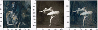
The first thing I tried was artistic style transfer using backprop. I got a working implementation up in pytorch and reproduced the style transfers featured here. I used the style/content layers and weights described in this paper which Gatys also used.
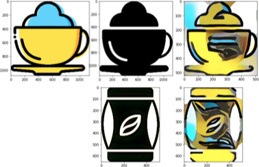
Now that I knew my implementation was working alright, I tried to make a black and white version of an icon take on the style of a yellow coloured version. This is the result:
The image on the left is the style image. The black icons are content images and the ones on the right are the results after 500 - 1000 iterations. So, not that great haha The colours are bleeding into the background and the results don’t look too good.
Experiments / learnings
Running less and more iterations didn’t help.
I visualized the recovered image from each style & content layer as suggested in Lesson 8 of Part 2. The content layer (conv4_2) actually recovers the cup very well, but can’t recover the white background (there’s still noise there after 500-1000 iterations), so that’s one of the reasons why the icon above has some colour bleeding into the background.
Gotchas
Don’t use PNGs for style transfer. There are 4 channels instead of 3, and my content-image actually went completely black (instead of being the cup icon). I only caught this after a couple of hours — need to visualize inputs & data earlier so I don’t make this mistake again.
Next steps
I’m starting to read some papers on colourization to see how they dealt with colours bleeding into places they shouldn’t go. Is this a sensible direction? What else should I be thinking about (e.g. paper suggestion / other approaches)?
That’s an interesting project. I could definitely use something like that. I can’t design logos either. I would first focus on generating interesting shapes. The color isn’t crucial. Maybe even just black and white could be good enough. Did you already build a dataset of logos? There are plenty of webfonts with icons. Training a GAN on that type of data could produce fun images.

 The colours are bleeding into the background and the results don’t look too good.