Long story short temporal adaptations follow changes in 4-mer composition and those changes are mainly in the structural components inside SARS-Cov2. The temporal time scale appears to be constrained by day length. How did I arrive at that conclusion? well, it wasn’t easy.
The first try was the analysis of stacked K-mer frequencies, with that analysis I was able to classify sequences by geographical origin. However most of the sequences were from Australia, but even if there were some sampling biases, there was enough information to correctly classify the sequences.
https://medium.com/p/7345b8f14072
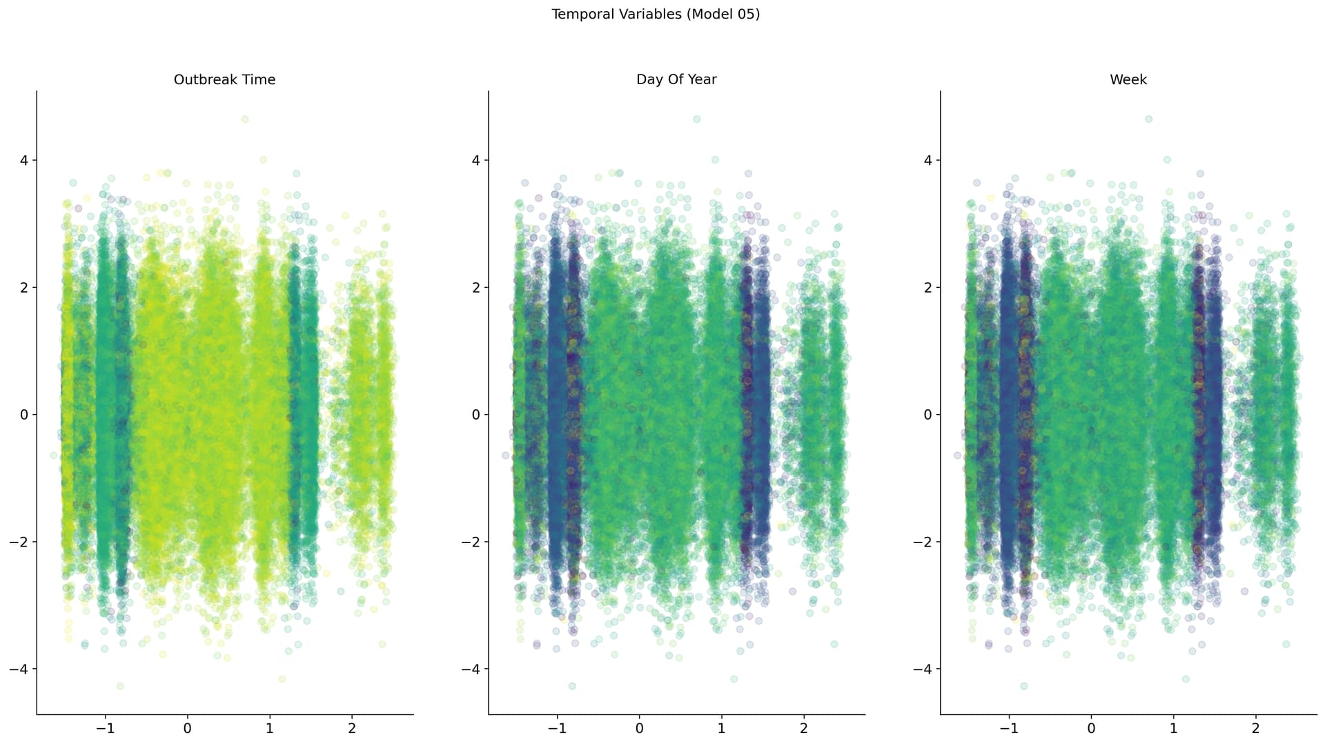
The next step aside from adding more data was to change both data and dimensionality reduction technique. But by adding more data PCA projection now classify SARS Cov2 sequences by a temporal component. A simple MLP VAE spread the separation between seasons and shows some hints of seasonality.
And playing around with graph encoded sequences also showed a temporal component and some clustering that I still have no idea if means anything.
But roughly it can be concluded that there’s enough information inside SARS Cov2 sequences to find meaningful patterns. And those patterns depend on both time and geographical location.
https://medium.com/p/4842696a43c
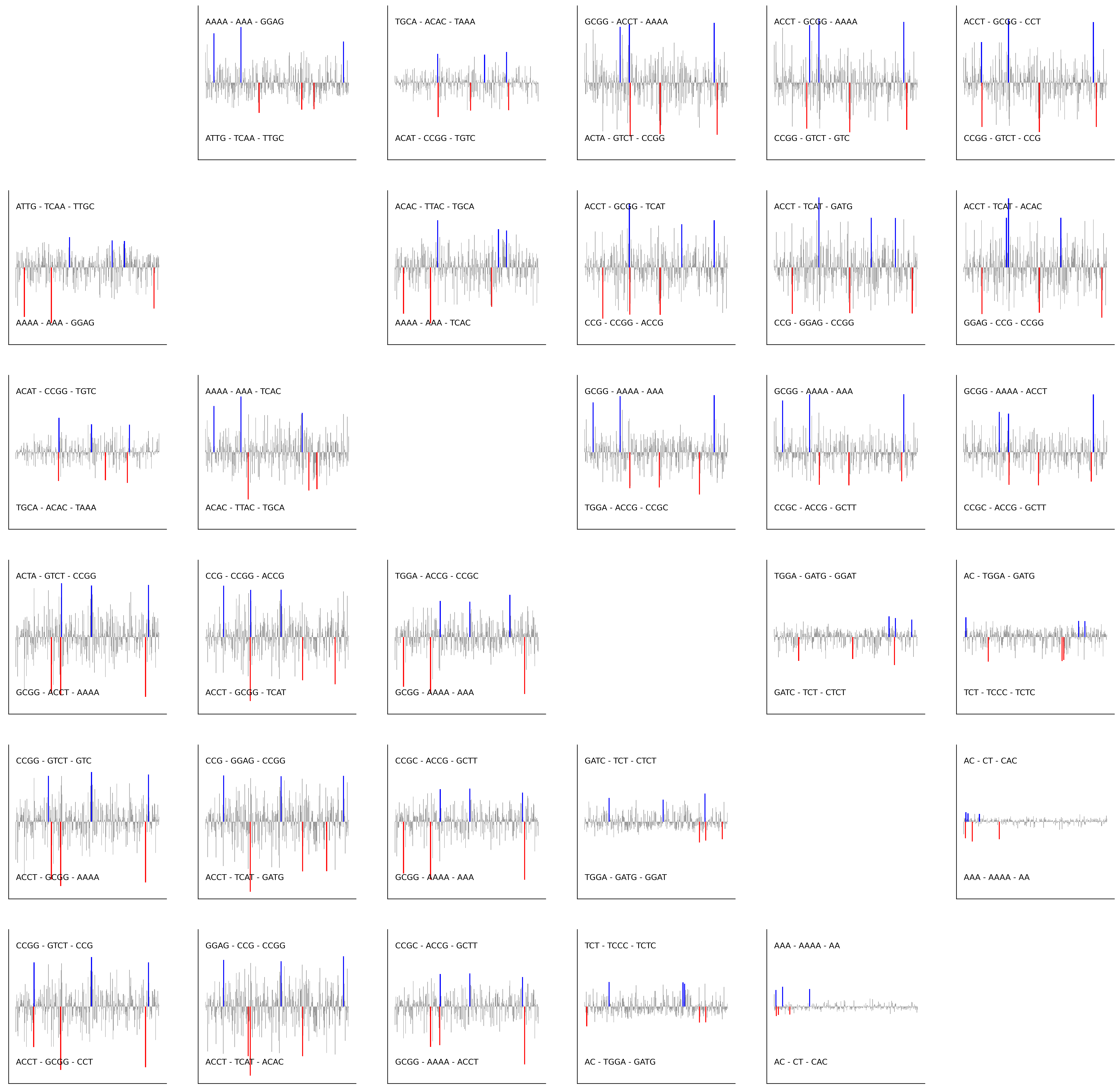
And adding complexity to the data structure used to represent the sequences was showing the ability to find inner structures. Finding the meaning of those is the difficult part.
Splitting the SARS Cov2 sequence as a series of subsequences and representing them as the adjacency matrix showed also the ability to order the sequence by a temporal component but decreasing model size. from around 300k parameters to 30k.

But even trying a wide range of metadata also showed not a definitive answer other than a time or environmental-related component.
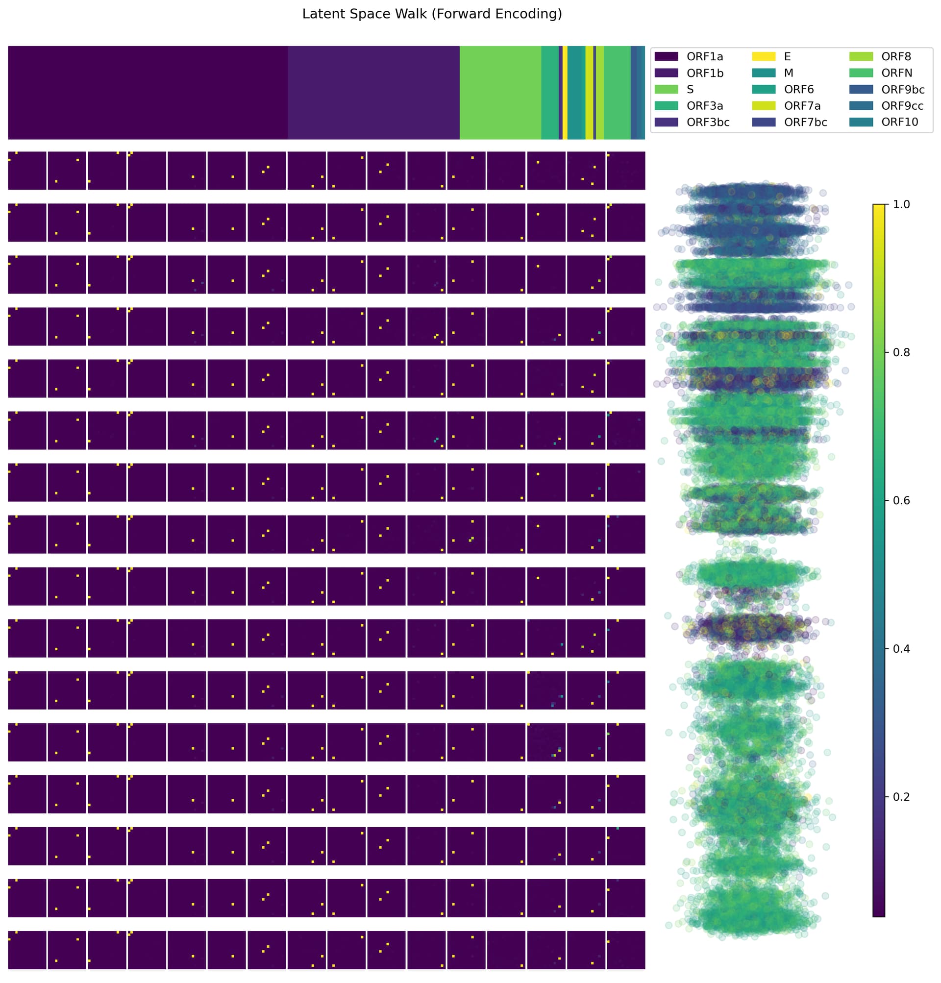
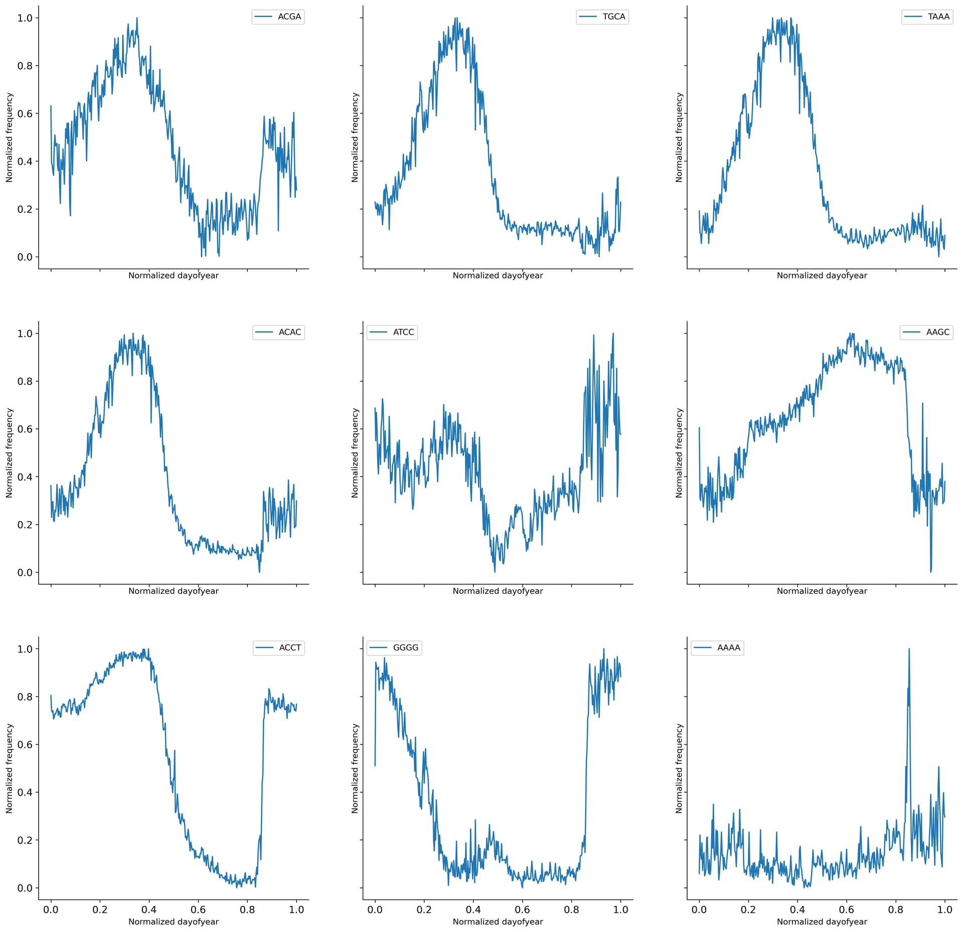
Latent space walks for both the simple MLP VAE model and the fragmented sequence model showed that specific 4-mer drove the temporal changes. Mean 4-mer composition showed wave-like behavior in both 4-mer and 2-mer.

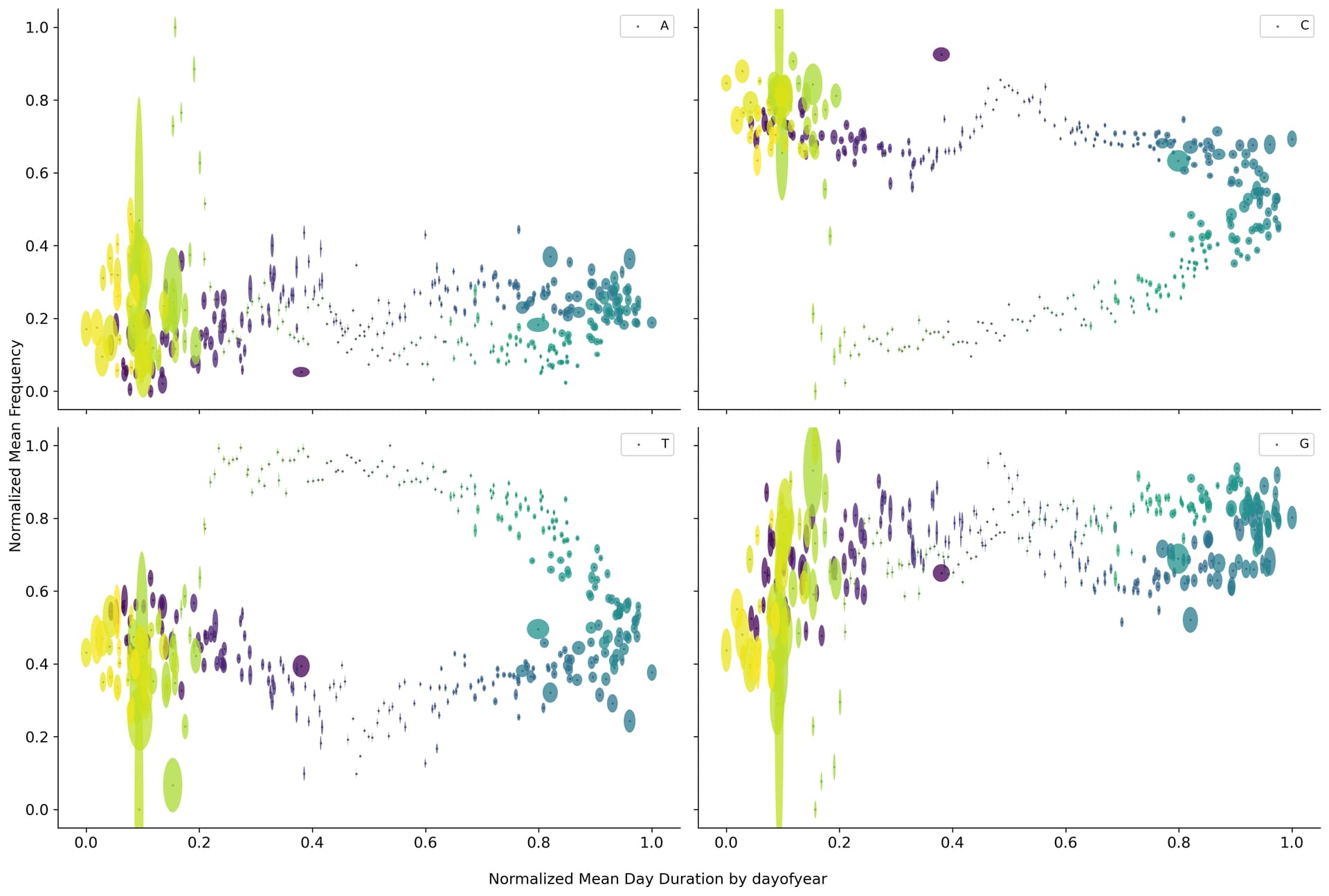
An easy way to combine both location and time was to use day length duration. Plotting means composition vs mean day length showed a circular path if the data is grouped by day of the year. Also, some overlaps in different time frames, encoded by color, could explain the overlap found in the different bottleneck representations.
But if the data is grouped by the overall pandemic time, the picture is not as clear. This could mean at least two things, one viral adaptation follows day length as a seasonal adaptation process, and viral evolution follows the overall pandemic time.
Or viral evolution tries to follow day length but continues to adjust and that lack of adjustment is visualized by the non-converging path.
Complete details, code, and kaggle notebooks can be found at the following link.
And if you want to support this guava-roll-fueled machine learning endeavor, please consider donating to one of the following platforms.
Or if you have more expertise in the area please consider endorsing my profile at arxiv for further reach. Thanks and see you in the next one.