Question
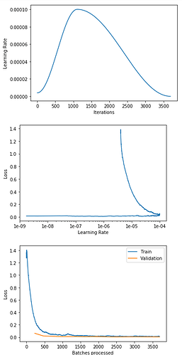
1. How come in the Graph 2, the loss shot up after the turn-around? What does this mean?
2. Why does Graph 3 look so good while Graph 2 looks so odd?
3. Graph 2, the loss seems all good when less than 1e-04, then why it out of sudden soars after the turn around?
4. What should I do to fix them?
Here are more details if you need to decipher the 3 plots:
| epoch | train_loss | valid_loss | error_rate | time |
|---|---|---|---|---|
| 0 | 0.288856 | 0.063495 | 0.022872 | 01:30 |
| 1 | 0.091351 | 0.021198 | 0.005851 | 01:28 |
| 2 | 0.049338 | 0.015004 | 0.004255 | 01:29 |
| 3 | 0.039335 | 0.011809 | 0.003723 | 01:31 |
| 4 | 0.053616 | 0.011104 | 0.004255 | 01:29 |
| 5 | 0.024912 | 0.011272 | 0.003723 | 01:29 |
| 6 | 0.025851 | 0.008456 | 0.003723 | 01:31 |
| 7 | 0.019442 | 0.010564 | 0.003723 | 01:29 |
| 8 | 0.018241 | 0.008668 | 0.002660 | 01:29 |
| 9 | 0.021824 | 0.005111 | 0.002128 | 01:29 |
| 10 | 0.014512 | 0.004437 | 0.001596 | 01:30 |
| 11 | 0.013420 | 0.005674 | 0.002660 | 01:29 |
| 12 | 0.018834 | 0.006534 | 0.002128 | 01:29 |
| 13 | 0.017591 | 0.005653 | 0.002660 | 01:30 |
| 14 | 0.011278 | 0.005128 | 0.001596 | 01:29 |
| 15 | 0.015454 | 0.004802 | 0.002128 | 01:29 |
tunedTransform = partial(get_transforms, max_zoom=1.5)

data = ImageDataBunch.from_folder(path=path_img, train=train_folder, valid=valid_folder, ds_tfms=tunedTransform(),
                                  size=(299, 450), bs=64, classes=['birds', 'others'],
                                  resize_method=ResizeMethod.SQUISH).normalize(imagenet_stats)

learn = cnn_learner(data, models.resnet50, metrics=error_rate).to_fp16()
learn.fit_one_cycle(16, max_lr=slice(1e-5,1e-4))