In a previous post shared some ideas about the use of VAEs to understand the internal structure within the SARS Cov2 sequence. And that structure was related to day length.
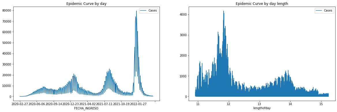
Let’s use Mexico’s pandemic cases as an example. Total cases through time show the different waves. While joining all the data by day length shows only two waves And pandemic cases always start to rise at the time with the lowest day length.
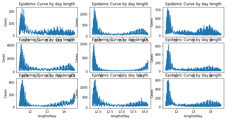
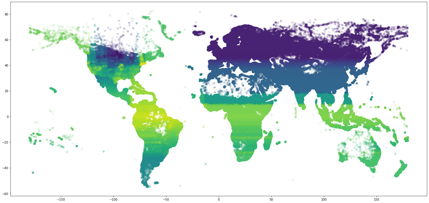
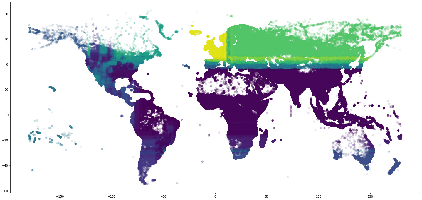
This specific pattern is easier to observe when the pandemic curves are plotted per specific geographic location
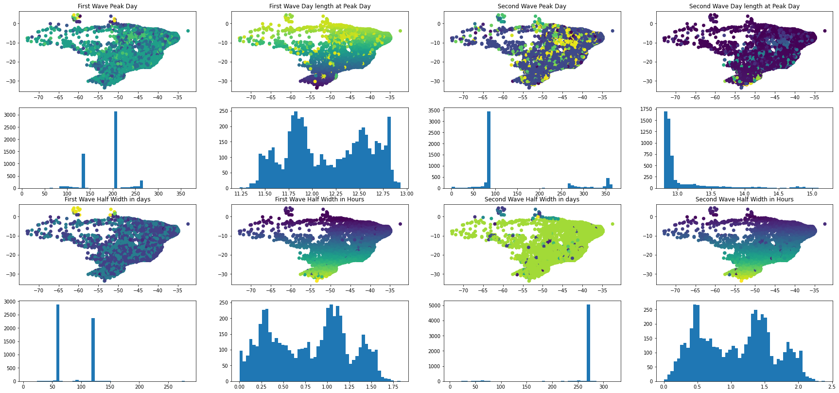
This specific characteristic can be used to analyze the number of cases throughout the year and to synchronize all the different epidemic curves to a single geographically dependent time scale. Calculating the pandemic peak and the half-width duration of the epidemic curves per each geographic location yields an ordered pattern.
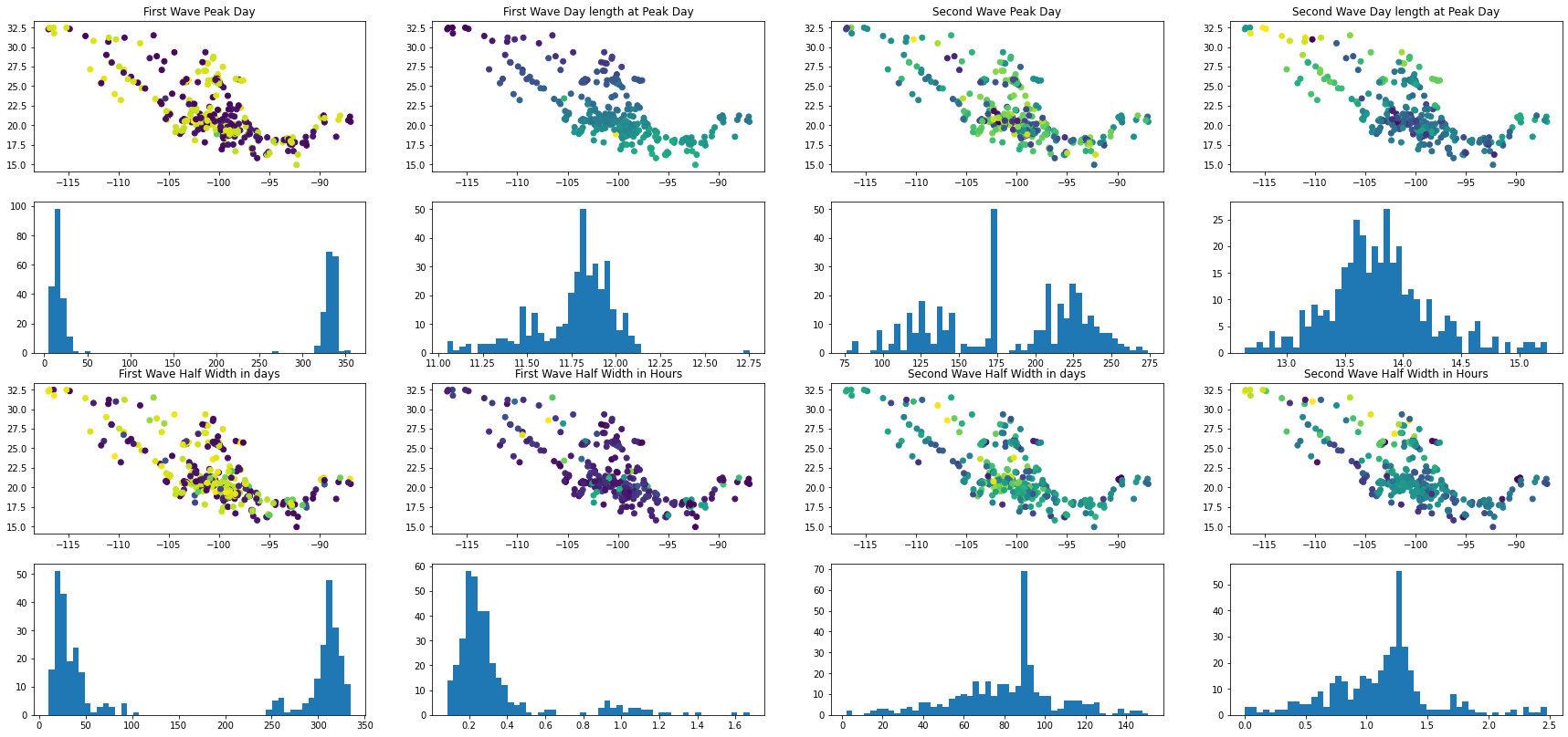
This analysis relies on the assumption that there are always two waves per year. There might be some caveats with this assumption and half-width might be not properly estimated. However, a particular order can be obtained under different geographical locations.
For example the USA
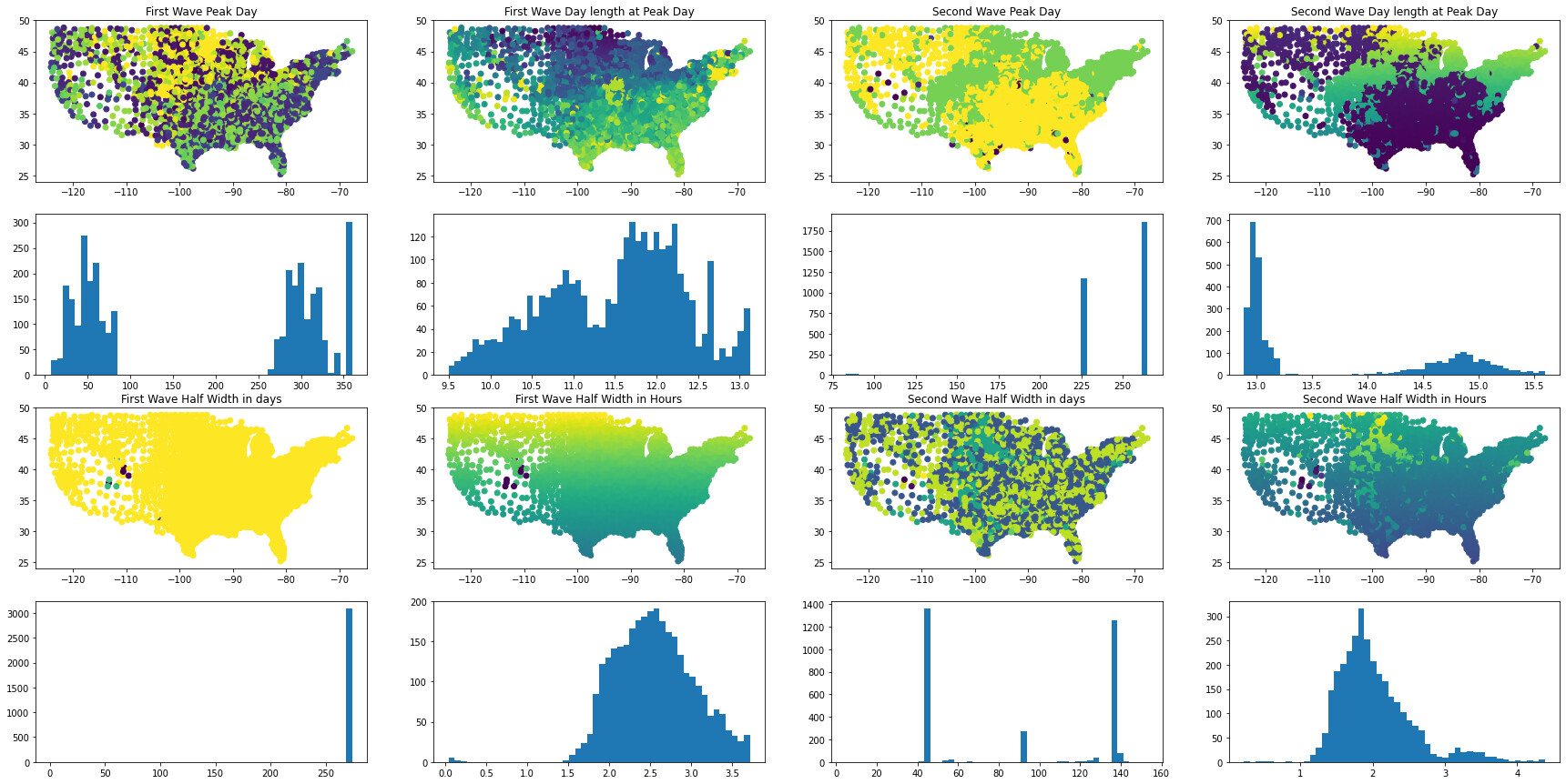
And Brazil
Complete world modeling of peak prediction appears to be in reach, yet more data is needed to get a more accurate view of viral spread.
First wave
Second wave
Data and scripts can be found on Kaggle under the following link.
If you think this can be helpful and want to help me to continue this coffee-fueled research endeavor consider joining one of the many different support platforms.
See you in the next one