Please use this category to discuss covid-19. Focus particularly on content likely to be of interest to this community - i.e. data driven, technical, practical, accessible. If you’re working on a project, feel free to create a topic and ask for help! Note: you need to read for 10 mins and look at 3 posts before the system lets you create a new topic.
This is a wiki post, so feel free to edit this to add links to data sources, modeling tools, important threads, and so forth:
Data sources
(Please include details like update frequency, format, scope, fields, etc)
This is a fastai related project, made with fastpages, an open source blogging platform with special features for Jupyter Notebooks. This dashboard has helpful visualizations and links to datasets, and is 100% open source. Furthermore, each dashboard is created with a Jupyter notebook so you can see where the data comes from with all of the code. Pull requests are welcome – showcase your modeling and visualization skills!
Source: University of Toronto School of Public Health
Updates: Daily
Format: Google docs spreadsheet (3 tabs)
Scope: Canada and 12 subregions (Provinces, Territories)
Fields: See the 2nd tab in the spreadsheet for details.
R Shiny Dashboard
Includes download handlers to download data powering all graphs as well as information about where the source is for various graphs.
https://isaac-flath.shinyapps.io/coronavirus2/
– Filter by state to look at cases, deaths, recovered, hospitalizations data by state. Some available by date, and some graphs have smoothing applied
https://isaac-flath.shinyapps.io/Covid-19/
– Coronavirus by country data including tests, cases, recovered, NPI, mobility, etc. Can filter to change to look at different countries, mobility changes over tie, NPI policy changes (link to codebook to explain what categories are).
–Minimal ability to do some graph transformation in UI such as apply smoothing, log scale, cumulative vs new daily.
@jeremy I was speaking with @MadeUpMasters and he is working on some interesting COVID-19 data analysis stuff. One thing that occurred to me is the lack of crowd sourced data. So I quickly made this yesterday and today (even though i’m not feeling great myself).
Is this kind of data of value to anyone? I am happy to make adjustments to the form to collect more valuable data points if needed. Everything is available in a Firestore NoSQL database.
Made with fastpages! It has examples of how to get relevant data, and useful visualizations, including some Bayesian models (by one of the core contributors to PyMC3). Would love more contributions from the fastai community- there has already been a few! It’s had 150k page views in only 4 days, so lots of visibility for people. Also a good way to get familiar with fastpages!
If you play with the tool, you’ll see there’s a huge difference between 5 social contacts a day and 20 a day. At < 5 contacts a day, the disease doesn’t spread. In many countries, at < 10 a day, demand remains within hospitals capacity to cope.
Thanks @salman. The site checks whether you’ve read 3 posts and spent 10 mins on the site first. These are Discourse’s defaults, to try to make sure that you’ve searched before posting. Can you try creating the topic again after doing that? Sorry for the trouble!
First crowd sourcing site I’ve seen in conjunction with Harvard Medical School and Boston Childrens - sister site to ‘flu near you’ that has been used by Boston Childrens. Provides visualizations of crowd sourced data.
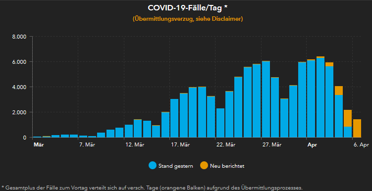
One of the interesting things is that the number of cases (Germany-wide) are typically lower than JHU (at times I have noticed differences of 10%, as I write this post its about 5%). Articles in Germany say that, that is related to the differences in the process of reporting and collecting this data. While RKI updates its data once a day, JHU does that several times a day. Furthermore, RKI relies on data from local public health authorities (this may result in delays of up to 2 days) while JHU appears to scan data from local newspapers to arrive at their numbers. I haven’t been able to figure out how exactly JHU does it. How do they avoid counting cases twice for example. Would be great if anyone could shed light on that. Is JHU less precise but faster? Perhaps time will tell.
Anyway, there’s an interesting pattern that emerges in the visualisation of the number of Covid-19 cases per day in Germany. The numbers drop on the weekends only to rise later and surpass those of ht previous week (some people might say its obvious?). That shows that it’s easy to make the mistaken conclusion that the curve is flattening based on data of a couple of days (politicians, have made that mistake, btw!).