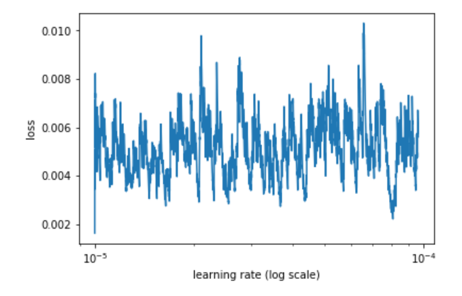
I am working on the Talking Data Kaggle competition on a subset (6 million) samples and when I trained my model on it, this is the learning rate plot I see. I can’t decipher what’s happening here. The loss function I am using is NLLloss. Any comments?
Is there a reason you’re only exploring the range between 10-5 and 10-4? In most of Jeremy’s examples he’s using a much higher upper bound for the max learning rate.
Thanks for the reply. I had actually tried all the values between 10-5 and 10 (default in lr_find()) but was playing with the plot and got the plot for just from 10-5 to 10-4!. Specifically, I was doing m.sched.plot(1) instead of m.sched.plot(10). Now, I find the plot to follow the usual pattern.