Hi,
I’m experimenting with a model and I think I’ve reached “the end of the line”. Here’s the plot of training loss/validation loss after 30 epochs:
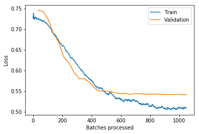
As you can see it looks, like the VL doesn’t go down much further. I’ve saved the learner at this stage and experienced with a lot of settings and hyperparameter combinations but nothing really lowers the validation loss further. I also ran another LRF and the graph was basically a straight-ish line then up so no downwards slope (I’ll add the image when the current model run is finished).
Is that the point where I should think to myself that’s probably as good as it gets (translates to about 72% accuracy, a good bit off the SOA for this task)?
The only thing I can think of that could lead to better results would be collecting more data (or I guess finding a magical hyperparameter combination that works better, but this is already the best out of 200ish combinations that were tried).
I’d generally be interested in some information on how you interpret graphs (LRF or plot_losses). I’d love a collection of graphs and thoughts/explainations (this looks like overfitting, we aren’t likely to see more improvements here etc. etc.). No idea how to search for this tbh.