Hello,
When I plot the top loses, I’m getting weird images.
Any idea why so?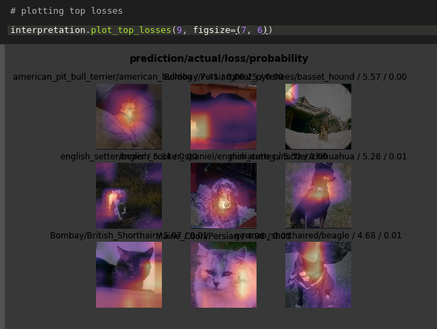
What you’re seeing is the heatmap laid on top of the original image. If you keep at it to part 2 you’ll get an in detail explanation but long story short: the yellow parts indicates where the convolutional neural net “focuses” in order to determine what animal+race the picture has.
I haven’t tested this, but try writing
interpretation.plot_top_losses(9, figsize=(7,6), heatmap=False)
to see the images without the heatmap (yes, it’s rather odd that the heatmap is on by default).
Another thread with the same concerns as you have: Lesson 1: plot top losses - distorted colors, 0.00 probability