I just started the course and was running Lecture 1 Jupyter notes on Colab.
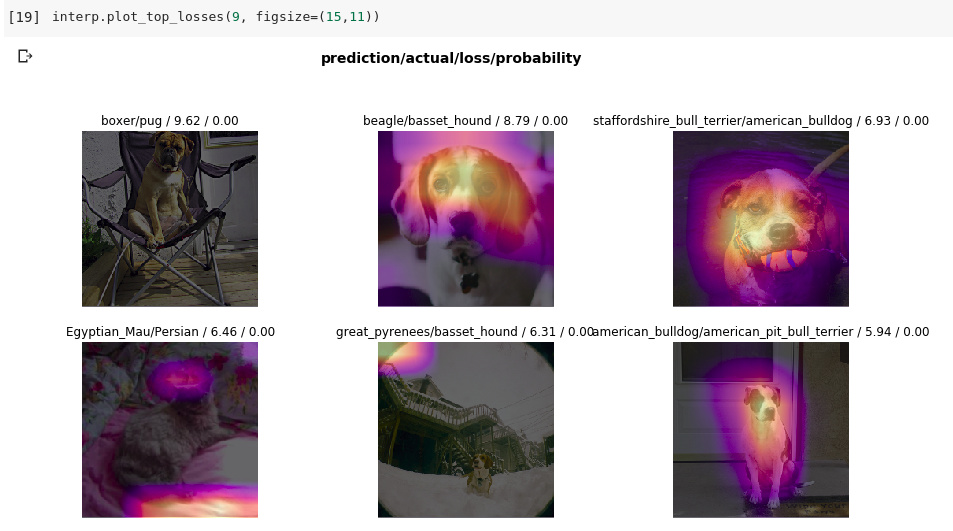
interp.plot_top_losses(9, figsize=(15,11)) function plots something like this
Welcome to Fast.AI and the forums! So the top_losses will be slightly different for most people compared to the lectures for a variety of reasons: every model trains slightly differently, perhaps there was a slightly different amount of epochs needed to hit the ‘problem children’ of the dataset, or perhaps just pure randomness introduced.
And the error rate would again be due to the above. I’ve seen this within my models, where the end result will be the same (roughly) but getting to that point can take a different number of epochs depending on the run! Does this help explain what you are seeing?
Thanks for such quick reply. The difference in error rate makes sense.
But are the weird looking images that the function outputs are becuase of “every model trains slightly differently, perhaps there was a slightly different amount of epochs needed to hit the ‘problem children’ of the dataset, or perhaps just pure randomness introduced” ?
Is that what you meant?
Exactly, for instance the boxer in the top left corner is one that is similar in my top losses I’ve seen running this notebook, but there could be others that it missed during that last epoch it ran (that’s what plot top losses shows)