Hi guys
I’m just starting out with fast.ai and trying to run the code from the notebook as is on my machine, with the pet dataset. When running plot_top_losses I get the following images with distorted colors and 0.00 probability (or very close to that).
Really glad I’m not the only one
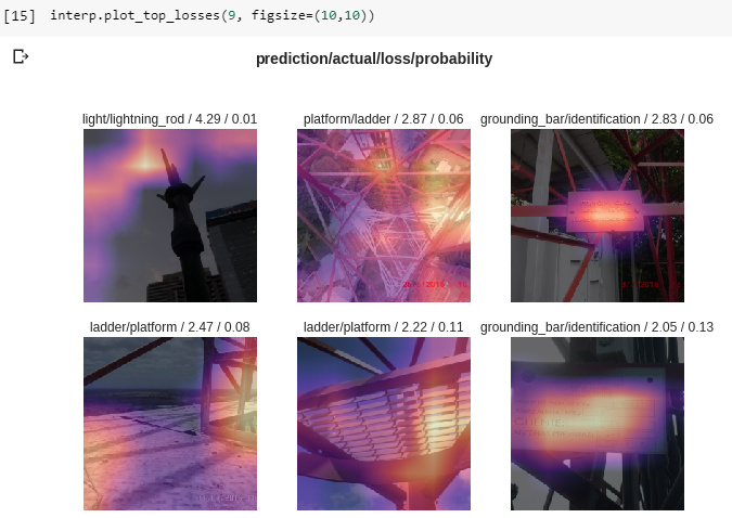
Finally managed to figure it out myself (at least for the colors) - When you only pass in two arguments to the function plot_top_losses, there is actually a third implicit one called “heatmap” which is default “True”, you can pass “False” instead and get the pictures in their original color
Looks like this is a new feature that was added to the fastai library last week! Pretty neat way to help you understand why it’s predicting what it’s predicting.
I am getting 0.00 probability for nearly all of my top losses as well. It seems odd that it would be so low. The probabilities displayed in the video were much higher. Can anyone provide some insight please?