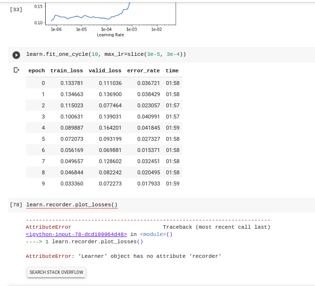
I was trying what I learnt in lesson 1 on some openly available data and I bumped into this graph as an output for learn.recorder.plot(). Can somebody help me with its meaning?
1 Like
If we follow the one_cycle_policy, our learning rate increases initially, then decreases to whatever you specify, which I am fairly certain is what we are seeing here. Is this right after you trained? Or after an lr_find()? I’ve seen this before during training alone and that is what I’m fairly confident in saying is happening here.
Ok. Thanks again. Its after lr_find().
Interesting it’s after an Lr_Find(), I’ve yet to see that myself. Others may be able to help guide on where to go from here, my best rationale is to pick right before or around 1e-04
Funnily enough I am unable to reproduce it. Anyways, I am still in lecture 2, a little more digging up and I might see it again and figure out why.
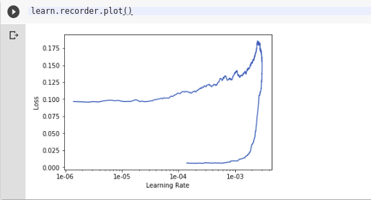
I’ve also gotten results like this. My interpretation is:
- The model starts out with relatively high loss (center top of the plot). Not much happens as the LR slowly increases and the line moves to the right. In rangitaranga’s plot, loss rises initially as the learning rate starts to increase and the function climbs out of some local minimum, whereas in hotmill’s plot the model makes modest but uneven progress;
- As the learning rate continues to increase and gets close to the peak of the cosine curve, both models suddenly hit a good patch where they learn fast and the loss drops significantly (right side of the plot), and finally
- As the learning rate declines towards the end of the cosine curve (heading left at the bottom of the plot), there is not much further improvement at the lower learning rates.
I think this shows that the training is most effective at the higher end of the LR scale (1e-3 to 1e-4 in hotmill’s post, or ~1e-3 in rangitaranga’s case). It also seems that in both cases, the learner spends more time than is productive at very low learning rates.
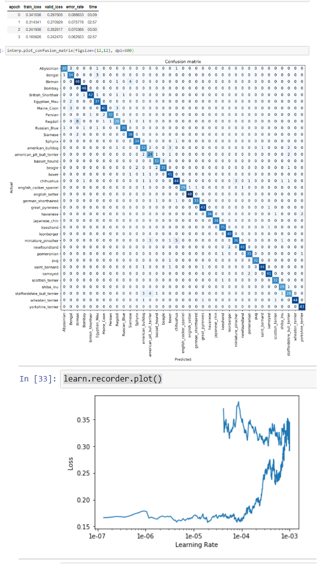
As an afterthought: learn.recorder.plot_losses() is a good companion plot to understand what is happening.