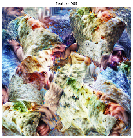
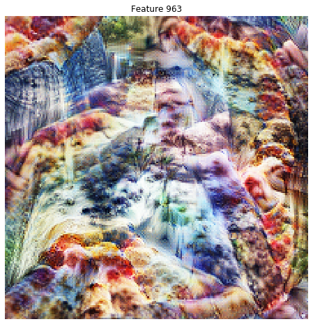
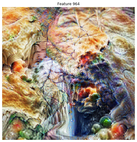
I tried to port the visualization techniques from Tensorflow Lucid to Fast.ai/Pytorch, as documented in the wonderful blog post at https://distill.pub/2017/feature-visualization/
I am seeing some initial success at finding interesting images. Please take a look at some examples at https://github.com/elichen/Feature-visualization
The code is simple, and involves gradient descent on the source image while optimizing for the mean activations of a feature channel. There are many techniques described in the paper and implemented in Lucid to improve imaging quality. The only one I implemented is “jitter”, which in Fast.ai terminology means random crop.
Please play with it, and post some interesting visualizations. And if you can help, these are some top priority features that would significantly improve the images generated:
- color decorrelation
- spatial decorrelation
- high frequency penalization
Thanks!