Partial Dependence discussion / questions

There were a lot of questions about partial dependence and how to build some of the plots, so I’m opening up a topic to create a space for discussion, sharing insights, and asking “dumb” questions here.

As Jeremy mentioned in class, this is a tricky topic to internalize and even trickier to explain. Please feel free to use this space to confirm what you know, clarify what you don’t know, or to help others gain clarity.

I can start! I helped answer these in person, but other people (hi friends!) may have better explanations or the same questions. Let’s archive our collective knowledge here.

I’ll be using @timlee 's notes as my reference text for the code

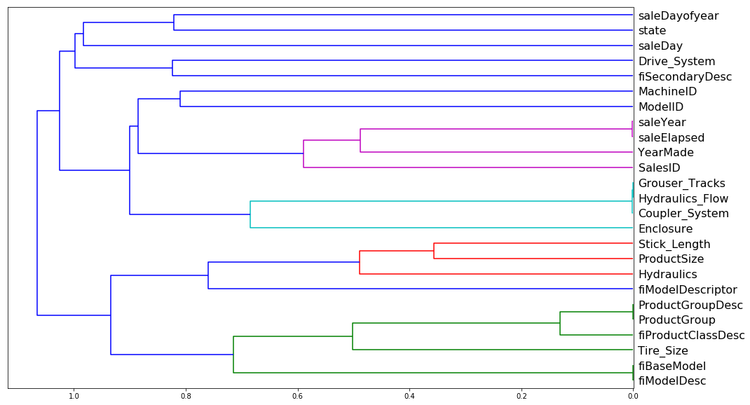
There was a question about the dendograms. Here’s the relevant code:

corr = np.round(scipy.stats.spearmanr(df_keep).correlation, 4)
corr_condensed = hc.distance.squareform(1-corr)
z = hc.linkage(corr_condensed, method=‘average’)
fig = plt.figure(figsize=(16,10))
dendrogram = hc.dendrogram(z, labels=df_keep.columns, orientation=‘left’, leaf_font_size=16)
plt.show()

How/why was that dendogram that built? Did we just pass in data frame df_keep before we passed the same data to our random forest regressor (RFR)? And then we decide which columns might be dropped? Or do we do pass our data first to RFR get the feature importance first and then pass the same data we fed to the RFR to double check the results? Where does building a dendogram happen in my order of operations with building or interpreting a tree?

Maybe the questions about the dendogram are actually proxy questions about the Spearman correlation? Feel free to provide the intuition about the Spearman correlation as well! Perhaps the question is in what part the of the random forest regressor workflow, does one do this analysis?

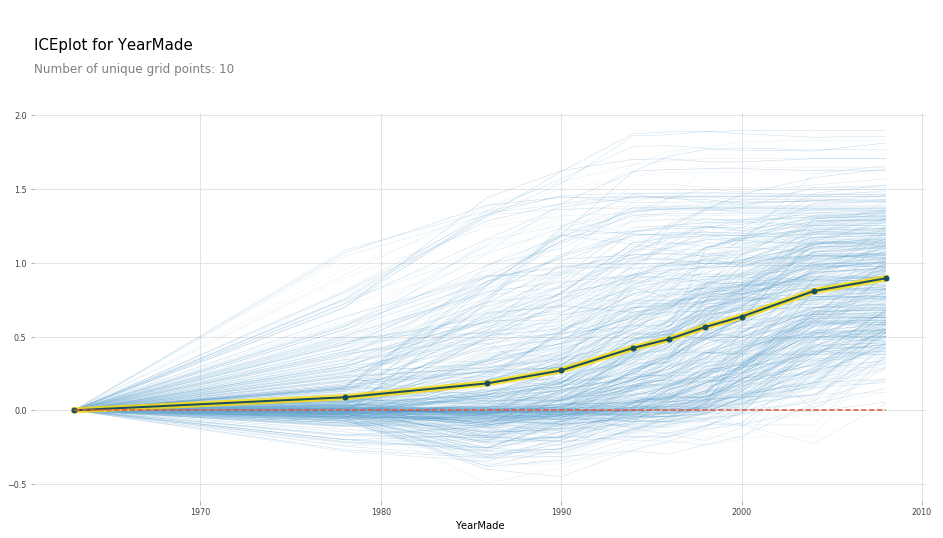
There was another question about the blue to yellow chart as part of types of plots for partial dependencies. What do those color bands mean? What exactly is being plotted?

If I’m rephrasing the questions wrong, original questioners please feel free to correct my misunderstanding!

Thanks in advance in helping your colleagues and thanks for using this topic as a way to practice your technical communication skills!

3 Likes

Very high level intuition I use to remind me what partial dependence plots are doing / explain in non technical terms:

  1. Imagine you’re sitting at a machine with lots of dials, sort of like a music studio or DJ booth.
  2. Imagine further that there are exactly as many dials as there are features (columns) in your data. Rotating each dial switches between all different values of that feature.
  3. You have a problem however: when trying to figure out what effect changing the “Year made” dial has on the music you’re producing, you notice that at every switch of the year made dial you make, a bunch of other dials randomly move around as well. This is the univariate graph’s problem too. You can observe time changing, but a lot of other things change as well with it, so you aren’t really sure what’s causing the change in the music.
  4. Partial dependence is sort of like having friends to put their hands on the other other dials to physically prevent them from moving. So when you change the Year Made dial, the output you see is purely based on the effect Year Made had on that combination of dial positions in the machine. This change is artificial in a sense, meaning the machine most likely has never seen this new combination of dials, thus the Random Forest is needed to make a prediction.
  5. To iterate this process, you can select a sample of known combinations of real dial settings, and iterate through every Year Made dial settings and observe the prediction our trained RF spits out. These individual outputs are the Blue Lines.
  6. As a summary, you can take the median of all outputs at a given time setting to see the ‘true’ effect of changing YMade, holding other things constant. This is the yellow line.

8 Likes

Thanks for this topic - great idea!

Might be a good idea to paste in the code sample you’re referring to. Dendrograms aren’t related to partial dependence plots and don’t use the RF at all. In the lesson I mentioned that the 3 lines of code to create them is just stuff that I copied from the docs - the details aren’t really important. Although we did talk in class about Spearman rank correlation, which is somewhat important.

Thanks for feedback! edited original post to include Spearman Rank Correlation question and added code snippet.

Hi @melissa.fabros I’ve created a toy example for you and hope everyone gets a sense of it. Sorry it might not be very pretty, 5 min fast work will improve it from the feedbacks.

Best

4 Likes

Thanks @cpcsiszar ! Can you help me understand what’s happening in your step 6? What do you mean by “take the median of all the outputs”?

If I’m understanding you correctly, I would be running the model with altered data where YMade = 1970 for all the observations and then change the dataset again and YMade =1980 and then again at YMade = 1990 and etc.
And then every time i re-run the model, what value am I saving? the feature importance of each category or the prediction accuracy? Where am i saving these values-- into a new dataframe?

But after i save these mystery values, then i do the calculate the median step (which gets me the yellow line)?

Asking for some friends :slight_smile:

Thanks in advance!

1 Like

Sure, let’s jump one step down from “very high level” intuition.
By the way, if what I’m saying isn’t entirely true please forgive me and I hope Jeremy or someone else can correct me. This is how I’m understanding it.

You’re very close, but the way Jeremy explained it in class actually has it the other way around. It could be quite computationally expensive to replace ALL rows with Year Made = 1950, 1951, 1952 … 1999, 2000 and then run the RF to predict prices (2000 - 1950) * n_rows times. All this for a simple pdp plot?

Instead, his approach suggests:

  1. Taking a random sample of, say, 100 rows from your dataset. These give you real, observed, “dial” settings (to continue the analogy above).
  2. For each row in your sample, you keep every value of each feature the way it originally was, and iterate over replacing the real Year Made value with every YM value range(1950, 2001). For every iteration, you run your trained RF on THAT one row. (This is equivalent to your friends holding down all the other dials, and you changing between all values of the YM dial). You record the Price prediction 50 times.
  3. You move to the next row in your sample, and again don’t change the other feature values, ONLY cycle through range( YM ). Predict price 50 times.
  4. Iterate through all your sample rows, never changing the values of your non-Year Made ‘dials’ (cells).
  5. Each of these ROW predictions = a blue line in the plot above (price on the Y axis, normalized to start at 0).
  6. Once you have your 100 row plots, you should have 100 price predictions per year (do you see why?). Take the median prediction of each year you made, and connect those over all years. That’s your yellow line.

More importantly however, do you understand what partial dependence plots are trying to show? They are “forcing” the universe to stay the same, and use our constructed RF to predict a hypothetical new price for an artificial object (bulldozer, whatever…). This process isolates the changes made to Predicted Price solely to Year Made. This is why pdp plots are superior to univariate plots in understanding the real causes and effects behind observed changes in our data

7 Likes

Thanks @kcturgutlu for helping with my friends to understand Spearman rank correlation. I’m having a hard time applying your definition to the dendogram visualization, (and the dendogram charts these Spearman Rank correlations, yes?)

As part of my data encoding, I’ve converted the labels to one-hot encoded data or gave them numbered labels. Is that what you mean by “continuous and discrete ordinal variables”?

If I look a the dendogram, I see that it’s making different splits and the final pairs of labels that are likely correlated. Can you help me develop an intuition about what’s happening under the hood when we’re running our data df_keep through a Spearman Rank Correlation analysis?

I believe that this procedure helps me identify redundant categories, then I can drop these redundant categories from my data set, and then later I re-train my Random Forest model with this new data, yes?

Asking for some friends :slight_smile: !

Thanks in advance!

Looks perfect to me! :smiley:

2 Likes

They “kind of” do, yes. Try watching that part of the video again - in it, I explain how pairs of variables are joined up one at a time. If that helps explain, perhaps have a go at saying what you think is going on, and if it doesn’t let us know where it started getting a bit confusing… :slight_smile:

And another thing to add. (might be trivial, but helps explaining why blue lines converge at 1950 - the base year)

When predicting for YM value range b/w 1950 to 2001 for a single observation (1 blue line), the Y axis is not those predictions, but the difference in predictions made in year Yi relative to base year (1950 in this case)

4 Likes

thanks @kcturgutlu . I know a lot of friends, even though they’re the quiet types, who’ll find your code walkthrough valuable and helpful!

Thanks for the detailed walkthough @cpcsiszar! I have a lot more clarity about how the procedure works now. I’m sure my friends will appreciate it! Hopefully they’ll chime in as well even though they tend to be the quiet types :wink:

Appreciate the patience with “dumb” questions!

@cpcsiszar, @melissa.fabros and @groverpr,
Thanks a lot for giving a detailed explanation! That really helps and makes internalize the concept better :slight_smile:

3 Likes

Happy to help :smiley:

Thanks so much for taking the time with these explanations Christopher - really helped me improve my understanding of this

You’re very welcome RichardG, and what a blast from the past re-reading this thread has been!

1 Like